
Introduction
Market structure is one of microeconomics' most practical frameworks — it explains why a wheat farmer accepts whatever price the market sets while a pharmaceutical company holding a patent can charge multiples of production cost. The difference comes down to competition levels, barriers to entry, and the number of firms in an industry.
For investment professionals, this isn't just academic. Understanding where an industry sits on the competition spectrum directly informs earnings quality, pricing power, and whether today's profit margins are sustainable or vulnerable to new entrants.
This guide covers all four market structure types — perfect competition, monopolistic competition, oligopoly, and monopoly — breaking down each diagram's key components and what analysts look for when translating these models into real investment insights.
Key Takeaways
- Market structures range from perfect competition to monopoly, with monopolistic competition and oligopoly in between.
- Every diagram uses the same axes (Q and P/C) and the same profit-maximization rule: produce where MR = MC.
- Profit or loss shows as the shaded area between AR (demand) and AC curves at the profit-maximizing output.
- Barriers to entry determine whether supernormal profits persist — low barriers don't, high barriers do.
- HHI scores and price-cost margins help place any industry on this spectrum.
What Is Market Structure in Economics?
Market structure in economics, as defined by OpenStax, describes how industries differ based on the number of sellers, ease or difficulty of entry, and the type of products sold. It determines how firms compete, how prices get set, and whether profits draw in new competitors or persist unchallenged.
Not to Be Confused with Trading Market Structure
The term "market structure" appears in two very different contexts:
- Economics definition (this guide): Industry organization — firm count, barriers to entry, product differentiation, concentration
- Finance/trading definition: Price action, trend analysis, order flow, and execution mechanics — covered by the CFA Institute's market organization curriculum and the SEC's equity market structure framework
These are entirely separate concepts. This guide focuses exclusively on the economics definition.
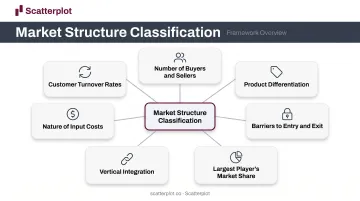
Seven Factors That Classify Market Structure
With that distinction clear, economists assess any industry across these seven dimensions:
- Number of buyers and sellers
- Degree of product differentiation
- Barriers to entry and exit
- Largest player's market share
- Extent of vertical integration
- Nature of input costs
- Customer turnover rates
These factors combine to place any industry into one of four categories, each with its own distinct diagram type.
The Building Blocks of Market Structure Diagrams
All four market structure diagrams share the same foundation. Once you understand the axes and curves, the differences between structures become much easier to spot.
Axes and Core Curves
- Horizontal axis: Quantity of output (Q)
- Vertical axis: Price or cost (P/C)
The curves present in most diagrams:
| Curve | Label | What It Shows |
|---|---|---|
| Demand | D or AR | Price consumers pay at each output level; also Average Revenue |
| Marginal Revenue | MR | Additional revenue from selling one more unit |
| Marginal Cost | MC | Additional cost of producing one more unit |
| Average Cost | AC | Total cost divided by output; shows cost per unit |
The Universal Profit-Maximization Rule
Regardless of market structure, firms produce where MR = MC. That intersection gives the profit-maximizing output level. Price is then read off the Demand (AR) curve directly above that point — not off the MR curve.
Reading Profit and Loss Visually
The area between the AR and AC curves at the profit-maximizing output tells the full story:
- AR above AC → shaded rectangle represents supernormal (abnormal) profit
- AR below AC → shaded rectangle represents a loss
- AR touching AC → the firm earns normal profit only
Normal vs. Supernormal Profit
This distinction is central to long-run analysis. According to CORE Econ, normal profit equals the opportunity cost of capital. It's already included in firm costs, meaning a firm earning normal profit earns zero economic profit. Supernormal profit means total revenue exceeds all costs including opportunity cost. In competitive markets, supernormal profit attracts entrants; in protected markets, it persists.
The Four Types of Market Structures and Their Diagrams
These four structures sit on a spectrum. As you move from left to right — perfect competition toward monopoly — pricing power increases, output typically falls, and profits become more durable.
Perfect Competition
Defining characteristics:
- Very large number of small firms
- Homogeneous (identical) products
- Free entry and exit
- Perfect information
- Zero pricing power — firms are pure price takers
The closest real-world approximation is agriculture. OpenStax identifies winter wheat — thousands of growers selling an identical product at whatever price the market sets — as the standard textbook example.
The diagram: Each firm faces a perfectly horizontal (perfectly elastic) demand curve at the market price. MR equals that price. The firm can sell any quantity at the going rate but nothing above it.
In the long run, entry and exit push the market to equilibrium where:
P = MR = MC = AC
The diagram shows all four curves meeting at a single point — the minimum of the AC curve. No supernormal profit survives long-run competition.
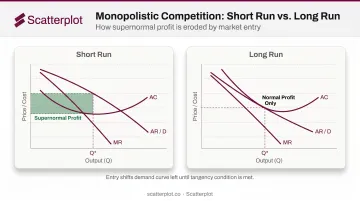
Monopolistic Competition
Defining characteristics:
- Many firms, each relatively small
- Differentiated products — branding, quality, location, reputation
- Some pricing power over their own product
- Free entry and exit in the long run
OpenStax-verified examples include restaurants, clothing stores, and grocery retailers. Product differentiation gives each firm what OpenStax calls a "mini-monopoly" over its own brand.
The diagram: Unlike perfect competition, the demand curve slopes downward — consumers view products as similar but not identical, so the firm has limited ability to raise prices without losing all customers.
Two time horizons to distinguish:
- Short run: Supernormal profit or losses are possible depending on demand and costs
- Long run: New entry erodes supernormal profit; firms exit if losses persist
That long-run equilibrium has a distinctive signature: the tangency condition. Entry shifts each firm's demand curve left until the AR curve is exactly tangent to the AC curve at the profit-maximizing output — yielding normal profit only. The firm operates at less than minimum efficient scale, which is why economists flag excess capacity as a defining feature of this structure.
Oligopoly
Defining characteristics:
- A few large firms dominate the market
- High barriers to entry
- Products can be homogeneous or differentiated
- Mutual interdependence — each firm's decisions directly affect rivals
Real-world examples are well-documented. The St. Louis Fed reported four major airlines controlled 80% of the U.S. market in 2015. The U.S. wireless market as of Q4 2024 showed T-Mobile at 34.7%, AT&T at 31.5%, and Verizon at 30.8% — three firms controlling essentially the entire market.
The kinked demand curve diagram is the classic oligopoly model, originating with Paul Sweezy's 1939 Journal of Political Economy paper:
- Above the current price: Demand is elastic — rivals won't follow a price increase, so the firm loses customers rapidly
- Below the current price: Demand is inelastic — rivals match any price cut, limiting market share gains
This creates a "kink" at the current price — and a discontinuity (gap) in the MR curve directly below that kink. The MR gap explains price rigidity: moving price in either direction worsens outcomes, so firms hold steady.
One important variant: colluding oligopolists effectively act as a joint monopoly. Their combined diagram resembles the monopoly structure, with shared supernormal profit replacing competitive tension.
Monopoly
Defining characteristics:
- Single firm controls the entire market
- No close substitutes
- Very high barriers to entry
- Maximum pricing power
OpenStax identifies three main barrier types:
- Natural monopoly: utilities where economies of scale make one firm the most efficient provider
- Legal monopoly: patents (20-year exclusivity), government licenses, and copyright (life of author plus 70 years)
- Resource control: ownership of a critical input competitors cannot replicate
The diagram: The firm's demand curve IS the market demand curve — downward sloping. MR lies below the demand curve and falls twice as steeply, because lowering price to sell an additional unit reduces revenue on all previous units.
Key features of the monopoly diagram:
- MR = MC gives an output level lower than under competition
- Price read off the demand curve above that point is higher than under competition
- The gap between AR and AC represents supernormal profit that persists in the long run — barriers to entry prevent rivals from eroding it
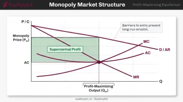
That durability of profit is precisely what regulators target — and why the monopoly diagram matters beyond the classroom.
Short Run vs. Long Run: How Market Structure Diagrams Shift
The same industry can look different across time horizons — and those differences matter for how analysts interpret current earnings.
Competitive Structures Adjust; Protected Structures Don't
In perfect competition and monopolistic competition:
- Short-run supernormal profit → new firms enter → supply increases → price falls → profit erodes
- Short-run losses → firms exit → supply contracts → price rises → losses disappear
- Graphically, the AR/D curve shifts left (entry) or right (exit) until only normal profit remains
In oligopoly and monopoly:
- Barriers to entry block this adjustment process
- Supernormal profits can persist indefinitely in long-run equilibrium
- The long-run diagram looks similar to the short-run diagram — no tangency condition, no erosion
What This Means for Analysts
A company reporting consistently high margins across multiple business cycles is almost certainly operating in a structure where barriers to entry protect those margins. This is precisely what equity analysts mean by a competitive moat — microeconomic theory made visible in earnings data.
The flip side: a business in a near-perfectly competitive industry may post strong margins during a favorable cycle, but new entrants will compress them as the market adjusts toward long-run equilibrium. Strong current margins don't tell the full story — the structure beneath them does.
Market Structure Analysis in Investment Research
Identifying an industry's market structure is one of the first steps in fundamental analysis. The diagram framework translates directly into questions analysts ask every earnings cycle.
Two Key Metrics from Market Structure Theory
Herfindahl-Hirschman Index (HHI)
The DOJ defines HHI as the sum of squared market shares across all firms in an industry:
- HHI below 1,000: Unconcentrated (closer to perfect competition)
- HHI between 1,000 and 1,800: Moderately concentrated
- HHI above 1,800: Highly concentrated (oligopoly/monopoly territory)
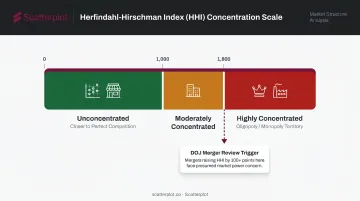
The DOJ uses HHI in merger reviews — transactions in highly concentrated markets that increase HHI by more than 100 points are presumed likely to enhance market power.
Price-Cost Margins
A firm's price-cost margin is a direct proxy for market power. Nevo's 2001 Econometrica study of the ready-to-eat cereal industry demonstrated how product differentiation and multi-product firm behavior explain observed margins — exactly the monopolistic competition and oligopoly dynamics the diagrams predict.
Moats, Market Power, and Pricing Power
Morningstar defines an economic moat as a durable competitive advantage allowing excess returns on capital over a long period. CFA Institute frames it as market power: the ability to price above marginal cost without losing customers to rivals.
Both concepts map directly back to the diagrams:
- Wide moat / high market power = oligopoly or monopoly structure, barriers to entry, persistent supernormal profit rectangle
- Narrow or no moat = monopolistic competition or near-perfect competition, tangency condition erodes margins over time
For financial advisers explaining why some sectors command valuation premiums while others trade at thin multiples, the market structure framework provides the underlying logic. Communicating that logic to clients, though, requires visuals that are ready when the conversation is. Scatterplot gives wealth managers daily-updated economic and market charts, fully branded, so advisers can bring these structural concepts into client meetings without rebuilding decks from scratch.
Disclaimer
The content on this site is for informational and educational purposes only and does not constitute financial, investment, legal, or tax advice. It should not be relied upon as the basis for any investment decision. Past performance is not indicative of future results. Always consult a qualified financial professional before making any financial decisions.
Frequently Asked Questions
What is market structure in economics?
Market structure describes how an industry is organized based on the number of firms, product differentiation, barriers to entry, and concentration. It is distinct from trading market structure, which refers to price trends, order flow, and execution mechanics — an entirely different concept used in finance.
What are the 4 types of market structures in economics?
Perfect competition (many firms, identical products, price takers), monopolistic competition (many firms, differentiated products, limited pricing power), oligopoly (few dominant firms, high barriers, mutual interdependence), and monopoly (single firm, maximum pricing power, persistent barriers to entry).
What are the 5 main markets?
The four standard structures plus contestable markets as the fifth. In a contestable market, even a concentrated industry faces competitive discipline because entry and exit costs are low — meaning the threat of new entrants constrains pricing, regardless of how many firms currently operate.
What is the difference between oligopoly and monopolistic competition?
Monopolistic competition has many firms, easy entry and exit, and only normal profit in the long run. Oligopoly has a few dominant firms, high barriers, and supernormal profits that persist — the long-run diagrams look fundamentally different, with oligopoly showing no tangency condition and a durable profit rectangle.
How do market structure diagrams show profit maximization?
All four diagrams use MR = MC to identify the profit-maximizing output level, with price read off the demand curve above that point. The shaded rectangle between the AR and AC curves at that output then reveals the result: supernormal profit when AR exceeds AC, or a loss when AR falls below it.