Key Takeaways
- Financial market charts translate raw price data into visual patterns that reveal trends, momentum, and market behavior.
- The three foundational types — line, bar (OHLC), and candlestick — show progressively more price detail per period.
- Advanced formats like Heikin-Ashi, Renko, and Point-and-Figure filter noise to emphasize trend clarity over time precision.
- Chart selection should always start with purpose: active analysis demands different formats than client-facing presentations.
- The right format for the right audience sharpens both your analysis and your client conversations.
Introduction
Not all financial charts are created equal — and that distinction matters more than most people realize.
A line chart and a candlestick chart can both display the same asset over the same period, yet communicate entirely different information. One shows a clean directional trend; the other reveals intraperiod volatility, sentiment shifts, and potential reversal signals.
Choosing between them isn't a minor formatting decision — it shapes what gets noticed, what gets missed, and how confidently someone can act on what they see.
For financial advisers and wealth managers, this choice operates on two levels. Chart selection affects the quality of internal analysis, but it also determines how clearly market insights land with clients during reviews and portfolio discussions. As Investopedia notes, line charts simplify complex data for clients — but that same simplicity works against you when volatility or price range is precisely what needs explaining.
This guide breaks down the main financial market chart types — what each one shows, where it falls short, and which situations call for which format.
What Are Financial Market Charts — and Why They Matter
Financial market charts are visual representations of price data for a financial instrument — stocks, indices, bonds, commodities, currencies — across a defined time period. Their core function is simple: translate numeric data into interpretable patterns.
Most charts draw from a standard set of data points known as OHLC — open, high, low, and close prices for each time interval, often accompanied by volume. Different chart types use some or all of these inputs, which is exactly why they communicate different information.
Why Chart Selection Is a Strategic Decision
Using the wrong chart type creates real problems:
- A line chart used to explain a volatile market obscures the full price range, leaving clients with an incomplete picture
- An OHLC bar chart shown to non-specialist clients can generate confusion rather than clarity
- A Point-and-Figure chart — useful for long-term analysis — may require more explaining than it's worth in a 30-minute review meeting
CME Group describes trading charts as essential to technical analysis because they provide a visual way to view price moves and form the backdrop for applying indicators. That's the analytical dimension. But for client-facing work, there's a second dimension: charts carry a communication function alongside their analytical one — and the two don't always call for the same format.
The SEC's Plain English Handbook recommends keeping graphics simple, drawing them to scale, and avoiding visual distortions — guidance that applies directly to client presentations.
Scatterplot is built around that principle, delivering daily-updated, professionally formatted chart visuals designed for client-ready presentations. Advisers get market-ready slides without spending hours sourcing data or rebuilding decks before every review meeting.
Core Chart Types: Line, Bar, and Candlestick
These three formats are the foundation of chart-based analysis. Understanding what each one shows — and what it deliberately omits — determines how effectively it can be used.
Line Charts
The line chart is the simplest format available. It plots a single continuous line connecting the closing price of each time period, giving a clean visual of directional movement over time.
What it does well:
- Communicates trend direction at a glance
- Accessible to non-specialist audiences without any explanation required
- Ideal for portfolio performance overviews, benchmark comparisons, and client-facing summaries
Where it falls short:
- Uses only closing prices — open, high, and low data are entirely omitted
- Cannot show intraperiod volatility, price gaps, or trading ranges
- Unsuitable for short-term trading decisions where price detail matters
For client presentations focused on "how has this performed over time," line charts are often the right default. When the question shifts to "what happened within each period," a more data-rich format is needed.
Bar Charts (OHLC)
The bar (or OHLC) chart adds three additional data points per period. Each vertical bar represents one time interval and displays:
- Opening price — left horizontal tick
- Closing price — right horizontal tick
- High price — top of the bar
- Low price — bottom of the bar
Those four data points open up analysis that closing prices alone can't support. Investopedia defines OHLC charts as bar charts displaying all four price points, making it possible to assess intraperiod volatility, price rejection zones, and momentum shifts invisible on a line chart.
What it does well:
- Shows full price range for each period
- Supports trend, volatility, and momentum analysis
- Useful for comparing price behavior across multiple periods
Where it falls short:
- Visually dense — experienced traders read it quickly, but non-specialist clients often find it confusing
- Doesn't provide the immediate sentiment read that candlestick charts offer
For investment professionals who need full price data without the extra visual encoding of candlesticks, OHLC is a practical choice — though candlesticks cover the same ground with one significant addition.
Candlestick Charts
Candlestick charts show the same four data points as OHLC bars — open, high, low, close — but add a visual encoding layer that makes sentiment immediately readable.
Each period is represented by:
- A body: the range between open and close, colored green/white (close above open, bullish) or red/black (close below open, bearish)
- Wicks: lines extending above and below the body showing the period's high and low
That color-coded body is what sets candlesticks apart. At a glance, you can see whether buyers or sellers controlled each period — without having to mentally calculate the relationship between opening and closing values.
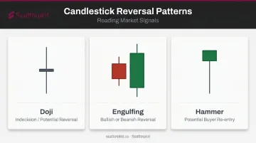
Beyond individual candles, specific formations create recognizable patterns that signal potential price behavior:
| Pattern | What It Signals |
|---|---|
| Doji | Open and close nearly identical — indecision, potential reversal |
| Engulfing | Second candle body engulfs the prior — bullish or bearish reversal depending on context |
| Hammer | Small body, long lower shadow after a decline — potential buyer re-entry |
What it does well:
- Body color makes bullish/bearish sentiment readable at a glance
- Widely supported across all charting platforms
- The standard format for technical analysis education and research
Where it falls short:
- Can become visually noisy on short timeframes with many candles
- Pattern recognition requires experience and context — a single hammer doesn't guarantee a reversal
Advanced Chart Types: Heikin-Ashi, Renko, and Point-and-Figure
Beyond the three core formats, several chart types take a different approach entirely — filtering or transforming price data to emphasize trend clarity over time-based precision.
Heikin-Ashi Charts
Investopedia defines Heikin-Ashi as a modified candlestick format that uses averaged price values calculated from prior and current period data. The name translates from Japanese as "average bar." The smoothing effect makes trends more visually continuous and easier to identify.
Best for: Trend-following analysis, reducing false signals in choppy markets, making directional momentum clear to viewers who struggle to read raw candlestick patterns.
Important caveat: Because Heikin-Ashi uses averaged data, the charts do not reflect actual traded prices. The displayed values won't match real market prices, making this format unsuitable for precise entry or exit decisions — or for client presentations where specific price levels need to be referenced accurately.
Renko Charts
Renko charts remove time from the equation entirely. Instead of plotting price at fixed intervals, Investopedia explains that Renko uses fixed-size "bricks" that appear only when price moves a defined amount in one direction — regardless of how long that movement takes.
A brick only gets added when there's a meaningful price move. Sideways chop generates nothing.
Best for: Filtering minor price fluctuations, identifying genuine directional trends, spotting support and resistance levels without short-term noise cluttering the view.
Key limitation: Brick size selection significantly affects what patterns appear. Change the brick size and you change the chart entirely. Time-sensitive events — earnings releases, Fed decisions — lose their temporal context completely.
Point-and-Figure Charts
Point-and-Figure (P&F) is one of the oldest chart forms, dating back to at least 1898 according to StockCharts ChartSchool. It uses columns of X's (rising prices) and O's (falling prices), with a new column beginning only when price reverses by a specified amount. There is no time axis — the chart records only price movement and supply/demand relationships.
Best for: Long-term analysis, identifying major support and resistance levels, filtering short-term noise without making brick-size decisions that affect the outcome.
Honest limitation: P&F charts require specialist knowledge to read. They're valuable for investment-professional analysis but rarely appropriate as standalone client-facing visuals without significant explanation.
How to Choose the Right Chart Type
Chart type selection starts with one question: what is this chart supposed to do?
The answer determines everything else.
For Active Trading and Analytical Depth
Candlestick and OHLC bar charts are the standard choice. They deliver the most price information per period and support the widest range of technical analysis techniques.
When trend-following matters more than precise timing, Heikin-Ashi and Renko remove noise effectively. That said, their limitations around actual price accuracy should be understood before relying on them for execution decisions.
For Client-Facing Presentations
Line charts are usually the right starting point. They communicate trend direction without requiring financial literacy, they don't invite questions the adviser didn't plan for, and they print cleanly in reports. The SEC's plain-English guidance supports this approach: simpler, well-scaled visuals that answer the client's question without overloading them.
A practical rule: start with the simplest chart that answers the question. Introduce complexity only when that added complexity directly serves the client's understanding.
For Long-Term Pattern Analysis
Renko and Point-and-Figure charts are worth incorporating when the goal is identifying major price levels or filtering years of data to find structural trends. Two caveats apply:
- Supplement with time-based charts to preserve context
- Avoid using them as primary client visuals without explanation
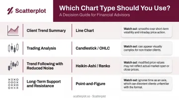
| Goal | Recommended Format | Main Watch-Out |
|---|---|---|
| Client trend summary | Line | Omits intraperiod volatility |
| Trading analysis | Candlestick / OHLC bar | Requires experience to interpret fully |
| Trend following (reduced noise) | Heikin-Ashi / Renko | Does not show actual traded prices |
| Long-term support/resistance | Point-and-Figure | Requires specialist explanation |
Choosing the right chart type is one part of the equation. For advisers who present market data regularly, production time is the other — sourcing data, building charts, and polishing decks can easily consume hours before a single client meeting. Scatterplot provides daily-updated, branded chart slides with guided talking points, so the right visuals are ready when you need them.
Disclaimer
The content on this site is for informational and educational purposes only and does not constitute financial, investment, legal, or tax advice. It should not be relied upon as the basis for any investment decision. Past performance is not indicative of future results. Always consult a qualified financial professional before making any financial decisions.
Frequently Asked Questions
What are the different types of charts in the stock market?
The main types are line, bar (OHLC), and candlestick charts, along with advanced formats including Heikin-Ashi, Renko, and Point-and-Figure. Each represents price data differently, ranging from the minimal (one closing price per period) to the highly filtered (price movement only, no time axis).
What is the difference between a candlestick chart and a bar chart?
Both show open, high, low, and close prices for each period. Candlestick charts add color-coded bodies that immediately indicate whether the period closed higher or lower than it opened — making bullish or bearish sentiment visible at a glance.
Which chart type is easiest for beginners?
Line charts are the most accessible starting point — they show only closing prices and require no interpretation of additional data fields. Candlestick charts are worth learning next because they are the professional standard and covered extensively in trading education resources.
What is a Heikin-Ashi chart and when should it be used?
Heikin-Ashi charts use averaged price data to produce smoother candles, making trend direction easier to see and reducing false signals. They work best for trend-following analysis, but avoid them when precise entry or exit price levels matter.
Which chart type works best for financial adviser client presentations?
Line charts are most effective — they communicate trend direction clearly without requiring technical knowledge from the client. Using consistent formatting and branded visuals across meetings reinforces professionalism and makes complex market conditions easier to discuss.