That distinction — between analyzing data and visualizing it — gets blurred constantly. The two terms are used interchangeably in conference presentations, job descriptions, and software marketing, which creates a real workflow problem. Advisers who conflate them risk spending time on the wrong output at the wrong moment: building charts before they've interpreted the analysis, or burying findings in spreadsheets that clients will never open.
This article draws a clear line between the two, explains how they work together, and offers a practical framework for wealth managers and financial advisers who want to use both more deliberately.
Key Takeaways
- Data analysis examines raw data to extract patterns and conclusions — it answers "what happened?" and "why?"
- Data visualization translates those findings into charts, dashboards, and graphics so they're immediately understandable
- Analysis comes first and builds the story; visualization comes second and tells it
- For advisers, analysis happens upstream — visualization is what drives client meetings
- Matching the right chart type to your analysis is what makes client presentations compelling — not confusing
Data Analysis vs. Data Visualization: Quick Comparison
| Dimension | Data Analysis | Data Visualization |
|---|---|---|
| Core Purpose | Examine data to find patterns and draw conclusions | Represent findings in a visual format for comprehension |
| Primary Output | Reports, models, statistical findings, written summaries | Charts, graphs, dashboards, infographics |
| Question Answered | What happened? Why? What's likely? What should we do? | What does this mean at a glance? |
| Primary Audience | Analysts, advisers, research teams | Clients, prospects, non-technical stakeholders |
| Typical Tools | Python, R, Excel, BI platforms, statistical software | Tableau, PowerPoint, purpose-built adviser platforms |
The relationship between the two is sequential, not competitive. Every visualization depends on prior analysis — you can't chart what you haven't first examined. But not every analysis produces a visualization; findings often live in written reports, data tables, or internal models.
That sequential relationship also points to a terminology distinction worth keeping straight: data analysis is a step — the act of examining and interpreting data. Data analytics is the broader discipline encompassing the full process: collecting, cleaning, modeling, and analyzing data to support decisions. Analysis is one phase inside that larger practice.
What Is Data Analysis?
Coursera defines data analysis as the practice of working with data to extract useful information that can support informed decisions — including examining investment portfolios to identify trends and guide future investment choices. Before an adviser can explain why equities outperformed this quarter or what a widening credit spread signals, someone must have done this work first.
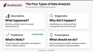
The Four Types of Data Analysis
Each type serves a different question — and each maps directly to adviser workflows:
- Descriptive: Portfolio returns last quarter, client cash flow history, benchmark performance
- Diagnostic: Sector attribution, identifying what drove a drawdown or underperformance
- Predictive: Forecasting rate movements, estimating retirement income risk
- Prescriptive: Recommending a rebalance, adjusting withdrawal sequencing based on risk signals
What Analysis Actually Produces
The output of data analysis is often not a visual at all. It may be a written finding, a statistical model, a risk metric, or a table of attribution data. The insight typically lives in a spreadsheet or a research note — formatted for analysts, not clients.
The tools involved — Python, R, Excel, BI platforms — require statistical reasoning and data literacy. For most wealth managers, this analytical layer is handled by research teams, third-party data providers, or specialized platforms. The adviser's role is to interpret what the analysis reveals and determine what it means for a specific client.
Where Analysis Fits in the Advisory Workflow
Data analysis supports advisory work in several concrete ways:
- Sourcing macroeconomic data to contextualize current market conditions
- Reviewing portfolio attribution reports after a quarter
- Interpreting risk metrics like standard deviation, Sharpe ratio, or drawdown
- Spotting allocation drift relative to a client's target weights
- Building investment theses grounded in macro or sector research
Each of these tasks draws on analytical inputs that advisers rely on — but don't always produce themselves. According to Kitces Research, lead financial advisers average 43 hours per week, with 6.6 hours going to planning and analytical support — reinforcing why reliable analytical inputs matter. When the analysis layer is handled well upstream, advisers can focus on what happens next: communicating findings to clients.
What Is Data Visualization?
IBM defines data visualization as the representation of data through graphics — charts, plots, infographics, animations — that communicate complex data relationships in an easier-to-understand way. The key word is communicate. Visualization is not analysis; it's the act of translating analytical findings into a form that non-technical audiences can absorb and act on.
Chart Types That Matter in Finance
Different visual formats serve different stories:
- Line charts — market trends over time, portfolio value growth, yield curve movement
- Bar charts — comparing asset class performance, sector returns, or benchmark vs. portfolio
- Scatter plots — correlation between variables, risk vs. return positioning
- Dashboards — combining multiple metrics into a single client-facing view
The choice of chart type should always serve the story, not the other way around. A scatter plot used where a simple line chart would suffice doesn't add nuance — it adds confusion.
Why Visuals Work for Client Communication
The cognitive case for visualization is well-supported. Brain Rules by John Medina reports that people remember 65% of information when a picture is paired with it, compared to just 10% of information heard — after three days. For advisers trying to make complex market dynamics stick in a client's mind between meetings, that gap matters.
Poor visualization damages trust just as quickly. A mislabeled axis, a truncated scale that exaggerates a trend, or the wrong chart type can misrepresent analysis and create compliance exposure. In 2024, the SEC charged five investment advisers for Marketing Rule violations involving misleading performance presentations, resulting in $200,000 in combined penalties. Effective visualization requires both accuracy and design judgment — they're inseparable.
The Practical Challenge for Advisers
For wealth managers and financial advisers, the challenge isn't just making any chart. It's producing branded, professional, consistently updated visuals that hold up in quarterly reviews, pitch decks, and client presentations week after week.
That's the problem Scatterplot was built to address. Founded by Sanjeev Pati, CFA, the platform gives advisers a ready-made library of daily-updated investment charts and market insight slides, with each adviser's logo, colors, and disclosures applied automatically. Key features include:
- Daily-updated charts sourced from third-party data providers
- Expertly crafted templates with full brand customization
- Guided talking points for each slide
- Presentation-ready decks without rebuilding charts from scratch
Where Visualization Fits in the Advisory Workflow
Visualization appears at every client-facing stage:
- Quarterly review decks summarizing portfolio performance and market context
- Market commentary slides explaining current economic conditions
- Prospect presentations building the case for an adviser's investment approach
- One-page summaries translating a complex thesis into a clear narrative
The research connecting clear communication to client trust and retention is consistent. Visuals are simply the most direct route to that clarity — which is why understanding where they differ from analysis matters before putting either to work.
Which Matters More: Analysis or Visualization?
Neither. The question itself is a false choice.
Data analysis without visualization stays trapped in spreadsheets. Data visualization without sound analysis produces attractive charts that mislead rather than inform. The more useful question is: which do you need right now, and for whom?
A Practical Decision Guide
Prioritize analysis when:
- Stress-testing a portfolio against a macro scenario
- Identifying drivers behind underperformance in a sector
- Allocation drift or risk concentration needs diagnosing
- Building or validating an investment thesis
Prioritize visualization when:
- Preparing for a client review or prospect meeting
- Explaining a complex market dynamic to a non-technical client
- Crafting market commentary for a quarterly email or newsletter
- A recommendation requires client consensus before you can act on it
The most effective advisers treat visualization as the final step in a workflow — not a separate creative project. When analysis is handled upstream by research teams, data platforms, or third-party providers, the adviser's job shifts almost entirely to communication. How clearly an adviser communicates in that moment often determines whether a client stays engaged, acts with confidence, or walks away confused.
How to Use Both Effectively in Client Meetings
A quarterly review has two distinct phases, and mixing them creates problems.
The analysis phase (before the meeting): Review market data, pull portfolio attribution, compare performance against benchmark, identify the two or three narratives that are most relevant to this specific client. This is diagnostic and interpretive work.
The visualization phase (building the meeting): Translate those findings into three or four slides that create a clear visual narrative. Not a data dump — a focused story with a beginning, a point, and a next step.
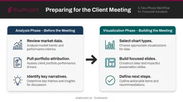
Separating these phases prevents information overload and sharpens the meeting's focus. Clients don't need to see every data point the analysis surfaced. They need to understand what it means for them.
The compounding benefit is real. Vanguard research found that 86% of advised clients reported greater peace of mind and 76% spent less time worrying — with a median reduction of two hours per week.
Clear, visual communication is a direct input to that outcome. Advisers who consistently deliver well-designed, data-accurate visuals reduce the "what does this mean?" questions in meetings and build authority over time.
Platforms like Scatterplot are designed specifically for this workflow split. It handles the visualization layer for advisers who already have analytical resources but lack the time or design infrastructure to produce polished, branded charts every week. At $99/month with a 7-day free trial, advisers get access to a library of client-ready slides that includes:
- Daily-updated charts on markets and the economy
- Full branding with your logo, colors, and disclosures
- Guided talking points for each slide
No rebuilding decks from scratch before every meeting.
Conclusion
Data analysis is how investment professionals make sense of complex market information. Data visualization is how they make that information useful for the people who need to act on it. In a complete advisory workflow, both are indispensable.
As data volumes grow and clients expect more transparency, the advisers who invest in strong visualization habits — backed by rigorous analysis — will retain more clients and win more referrals. The advisers who don't will keep treating visualization as a last-minute slide deck fix — and their clients will notice.
Disclaimer
The content on this site is for informational and educational purposes only and does not constitute financial, investment, legal, or tax advice. It should not be relied upon as the basis for any investment decision. Past performance is not indicative of future results. Always consult a qualified financial professional before making any financial decisions.
Frequently Asked Questions
What is data analysis and visualization?
Data analysis is the process of examining data to uncover patterns, trends, and conclusions. Data visualization is the practice of representing those conclusions graphically — through charts, dashboards, or infographics — so they're immediately understandable. The two form a connected workflow: analysis uncovers the story; visualization tells it.
What are the four types of data visualization?
The main categories are: charts and graphs (bar, line, scatter, pie), geospatial and map visuals, dashboards that aggregate multiple metrics in one view, and infographics that combine data with narrative context. Choosing the right format depends on your data type, your audience's familiarity with the subject, and what decision you're trying to support.
What are the 3 C's of data visualization?
The 3 C's — Clarity, Context, and Consistency — are a practical mnemonic, not a formal standard. Clarity means one idea per visual, without clutter. Context frames the data so audiences know what they're seeing. Consistency keeps design choices (colors, labels, scales) predictable throughout a presentation.
What is the difference between data analysis and data analytics?
Data analysis is a specific action: examining and interpreting data to derive findings. Data analytics is the broader discipline that encompasses the full process — collecting, cleaning, modeling, and analyzing data to support decisions.
Why is data visualization important for client communication in financial advising?
Most clients don't have analytical or financial backgrounds, so raw data and model outputs mean little without visual context. Strong visualization bridges the gap between complex market data and client understanding, making trade-offs easier to grasp, building confidence in the adviser's recommendations, and reducing the cognitive load that leads to decision paralysis.