Introduction
Financial advisers and wealth managers are sitting on more data than ever—market returns, economic indicators, portfolio metrics, earnings releases. The challenge isn't access to information. It's turning that volume of raw data into clear, confident client conversations.
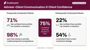
That gap is measurable. YCharts' 2024 survey of 775 advised clients found that typical adviser conversations resonated with clients only 64% of the time—and for clients contacted infrequently, comprehension dropped to just 54%. Meanwhile, 75% of respondents had switched advisers or considered doing so in 2023.
Those numbers point to a specific gap: advisers have the data, but not always a reliable process for translating it into something clients can act on. Financial data analysis is the structured practice that bridges raw numbers and investment decisions. In 2026, AI-assisted tools and clients who arrive pre-researched have changed what that process needs to look like. This guide covers what financial data analysis actually involves, which techniques matter most for wealth management, and how to build a repeatable workflow that holds up in client meetings.
Key Takeaways
- Financial data analysis means collecting, cleaning, and interpreting market data to support investment decisions and client communication.
- A six-step workflow drives effective analysis: define the objective, gather data, clean it, apply a technique, visualize results, then communicate.
- Core techniques include trend analysis, ratio analysis, correlation, scenario modeling, and benchmarking—each suited to different questions.
- Tools range from spreadsheets and BI platforms to adviser-specific solutions with pre-built, client-ready visuals.
- Most adviser workflows struggle less with analysis and more with translating outputs into visuals clients actually understand.
What Is Financial Data Analysis?
Financial data analysis is the structured examination of financial datasets—market prices, economic indicators, earnings figures, portfolio performance—to identify patterns, assess risk, and generate insights that inform investment decisions.
Two modes sit at the core of any rigorous approach:
- Quantitative analysis works with numerical data: statistical models, trend lines, ratio calculations, correlation coefficients. Results are precise, repeatable, and easy to audit.
- Qualitative analysis incorporates non-numerical information: earnings call tone, management commentary, geopolitical context, sector narratives. It adds texture that numbers alone can't capture.
Effective advisers use both — quantitative work without context misses the story; narrative without data lacks credibility.
Where This Applies in Wealth Management
The most common use cases for financial data analysis in advisory work include:
- Portfolio performance review — attributing returns, measuring against benchmarks, and translating outcomes into plain language for clients
- Market opportunity identification — spotting directional trends in asset classes or sectors before they're consensus
- Risk assessment — identifying portfolio vulnerabilities, concentration risk, or factor exposures
- Client reporting — turning performance data into clear, branded summaries advisers can present with confidence
- Macroeconomic context — helping clients understand how broader conditions affect their portfolios
Why Financial Data Analysis Is Critical for Wealth Advisers
The evidence for structured, data-backed communication is hard to ignore. From the same YCharts survey: clients contacted frequently reported 71% confidence in their financial plan during a recession versus just 22% for infrequently contacted clients. Among clients with more than $500,000 under advisory management, 98% wanted their adviser's perspective on markets and the economy, and 88% said personalized communication would influence their decision to stay.
This isn't just a client satisfaction question—it's a retention question.
Disciplined financial data analysis supports advisers in several concrete ways:
- Surfaces evidence that intuition alone can't provide, improving recommendation quality
- Catches market shifts and portfolio vulnerabilities before they become client complaints
- Replaces ad hoc research with repeatable workflows, cutting meeting prep time
- Builds trust through clear, evidence-backed narratives rather than generalities
- Creates auditable analysis processes that protect advisers when regulators ask questions
The friction on the technology side is real too. Advisor360's 2025 Connected Wealth Report found 45% of enterprise advisers cited "bad data" as their top technology challenge, and 74% said their firm's technology wasn't fully integrated. Both gaps directly undermine the quality of analysis and client-facing output.
Key Types of Financial Data and Analytical Techniques
Not all financial data answers the same question. Before selecting a technique, advisers need to understand which type of data they're working with.
Market Data vs. Fundamental Data vs. Macroeconomic Data
| Data Type | What It Includes | When Advisers Use It |
|---|---|---|
| Market data | Prices, returns, volume, volatility | Trend analysis, benchmarking, performance review |
| Fundamental data | Earnings, P/E ratios, balance sheet metrics | Security valuation, quality screening |
| Macroeconomic data | GDP, inflation, interest rates, employment | Portfolio positioning, macro context for clients |
Most advisers need all three for a complete picture. Market data tells you what happened; fundamentals tell you why a security is priced that way; macro data tells you what environment you're operating in.
Core Analytical Techniques for Financial Advisers
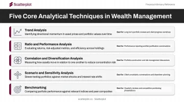
The five techniques with the most practical value in wealth management contexts:
Trend analysis — Tracking directional patterns in asset prices or economic indicators using line charts and moving averages. Best for identifying momentum and regime changes over time.
Ratio and performance analysis — Comparing metrics like P/E ratios, Sharpe ratios, or benchmark-relative returns. As the CFA Institute notes, ratios show what happened but not why—pair them with context and appropriate peer groups.
Correlation and diversification analysis — Evaluating how assets move relative to each other to manage portfolio risk. Critical for confirming whether a portfolio is truly diversified or just spread across correlated positions.
Scenario and sensitivity analysis — Stress-testing portfolios under different conditions: rate hikes, recessions, inflationary spikes. Outputs should always include the assumptions behind them.
Benchmarking — Comparing portfolio or asset performance against relevant indices. The SEC's 2024 Marketing Rule Risk Alert flagged benchmark comparisons without sufficient context as a recurring deficiency—benchmarks need definitions, comparability disclosures, and a fair time period.
The practical trap: Relying on one or two techniques in isolation. A trend chart without ratio context, or a correlation matrix without a macro overlay, leaves gaps that clients may notice before you do. Combining at least three of these techniques in any client review produces analysis that holds up under follow-up questions.
How Financial Data Analysis Works: Step by Step
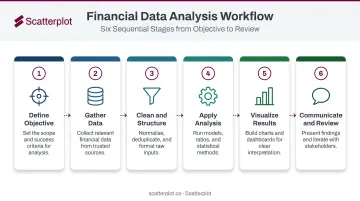
This six-step workflow reflects how financial analysis actually runs in practice — from the first question to the final client conversation.
Step 1 – Define the Objective
Before touching any data, clarify what question the analysis is meant to answer. Is this about portfolio performance attribution? A client's retirement runway? A positioning decision ahead of a rate decision? Without a clear objective, analysis sprawls and insights become vague.
Step 2 – Gather Financial Data
Identify the sources required for the objective. Common inputs include:
- Market feeds and real-time price data
- Economic data releases (CPI, NFP, GDP)
- Portfolio management systems and custodian reports
- Third-party research platforms
Data quality and timeliness matter here. Stale or incomplete data doesn't just produce weak analysis — it can produce misleading conclusions that damage client trust.
Step 3 – Clean and Structure the Data
This step gets skipped more than any other. Normalizing date formats, handling missing values, removing outliers, and aligning time periods across datasets determines whether analysis runs cleanly or produces artifacts. The output quality of any model is bounded by the input quality of the data.
Step 4 – Apply the Analysis
Select the appropriate technique based on the objective defined in Step 1. The choice of method shapes the type of insight produced — a trend line reveals direction, a correlation matrix reveals relationships, scenario analysis reveals vulnerabilities. Using the wrong method doesn't just produce weak results; it produces the right answer to the wrong question.
Step 5 – Visualize and Interpret Results
Translate numerical outputs into visual formats:
- Line charts for price trends and performance over time
- Bar charts for comparisons across periods, sectors, or holdings
- Scatter plots for correlation relationships
- Waterfall charts for return attribution
A technically correct chart that confuses a client has failed its purpose. Interpretation must always connect back to the investment narrative—not just describe what the chart shows, but explain what it means for the client's portfolio.
Step 6 – Communicate and Review
Package insights for client delivery: talking points, presentation slides, or dashboard summaries. Analysis is only complete when it drives a decision or a conversation. Because markets evolve, the cycle should be reviewed regularly — quarterly at minimum, and whenever significant macro events shift the context.
Financial Data Analysis Tools in 2026
The adviser tool landscape has matured into distinct tiers. The 2025 T3/Inside Information Software Survey, based on 2,128 advisory-firm responses, found:
- Portfolio Management/Reporting Tools: 67.48% market penetration
- Investment Data/Analytics Tools: 51.46% penetration (Morningstar Advisor Workstation at 19.41%, YCharts at 14.90%)
- Economic Analysis and Stress-Testing Tools: 39.71% penetration
These numbers confirm that most advisory firms now run specialized analytics stacks. Spreadsheet-only workflows have largely given way to purpose-built tools.
Three Tiers of Tools
| Tier | Examples | Best For |
|---|---|---|
| General-purpose | Excel, Google Sheets | Flexible analysis, custom modeling |
| Analytics & BI platforms | Morningstar Advisor Workstation, YCharts, Bloomberg | Market data, investment research, screening |
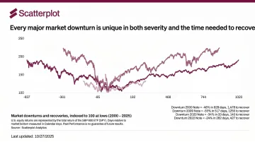
| Adviser-specific solutions | Scatterplot | Client-ready visual output, meeting preparation |
Key Evaluation Criteria
When assessing any tool, advisers should weigh:
- Data update frequency — daily vs. weekly vs. manual refresh
- Chart customization and branding — whether outputs can carry firm identity
- Integration with existing workflows — how it connects to CRM, portfolio systems, or presentation tools
- Quality of client-facing visual output — whether charts can be used directly in meetings
AI-Assisted Analysis in 2026
AI adoption among advisers is accelerating. Schwab's 2025 RIA Benchmarking Study reported 68% of participating firms use AI in some capacity, and J.D. Power found 35% of advisers said AI is the top technology their firms should invest in.
Adviser judgment still drives how AI outputs get applied to individual client situations — no tool replaces that context. Regulatory scrutiny is also real: the SEC charged two investment advisers in 2024 for making false and misleading statements about their AI capabilities, confirming that "AI-powered" claims carry compliance weight, not just marketing appeal.
On the supervision side, FINRA's Regulatory Notice 24-09 makes clear that existing obligations — communications standards, recordkeeping, and supervision — apply fully to AI-generated content.
How Scatterplot Helps Advisers Turn Data Into Client-Ready Insights
Most advisers lose the most time not in the analysis itself—but in what happens after it: sourcing updated charts, building presentation decks, adding disclosures, and polishing slides before every client meeting. Scatterplot is built specifically for that bottleneck.
Scatterplot is a daily-updated library of professionally designed investment visuals covering markets and the economy. Every slide is fully branded with the adviser's logo, colors, and disclosures—applied automatically so no manual formatting is required.
Mapped to the six-step workflow described above, Scatterplot covers Steps 2 through 5 for the market and economic data advisers rely on most:
- Sources and structures the underlying data
- Keeps every chart current with daily updates
- Delivers polished, branded visuals ready for client presentations
- Exports as PDF downloads for quick sharing or printing
Where most tools stop at the visual, Scatterplot also addresses the narrative. Connecting a chart to a client's specific situation requires clear language, not just a clean slide. The guided talking points feature gives advisers a structured starting point for explaining what a chart shows and why it matters.
The result: client conversations backed by credible, current, consistently branded content—without hours of preparation.
For individual advisers and wealth managers without a dedicated research team, Scatterplot delivers professional-grade client communication at $99/month, with a 7-day free trial to get started.
Disclaimer
The content on this site is for informational and educational purposes only and does not constitute financial, investment, legal, or tax advice. It should not be relied upon as the basis for any investment decision. Past performance is not indicative of future results. Always consult a qualified financial professional before making any financial decisions.
Frequently Asked Questions
How does finance use data visualization?
Financial data visualization converts complex market and portfolio data—price trends, performance metrics, economic indicators—into charts and graphs that make patterns and risks immediately visible. For advisers, it speeds up internal decision-making and replaces raw data tables with visuals that clients can actually engage with.
What are the most important types of financial data for investment advisers?
Advisers draw on three core categories: market data (prices, returns, volatility) to track what's happening, fundamental data (earnings, valuations, balance sheets) to explain why, and macroeconomic data (inflation, interest rates, GDP growth) for broader context. All three typically feed into a complete investment picture.
What is the difference between quantitative and qualitative financial analysis?
Quantitative analysis uses numerical data and statistical techniques—ratios, trend models, correlations—to produce measurable, auditable outputs. Qualitative analysis incorporates non-numerical factors like management quality, earnings call tone, or geopolitical context. Both matter; quantitative analysis without qualitative context can miss the story behind the numbers.
What tools do financial advisers use for data analysis?
Options range from Excel and Google Sheets for custom analysis, to Morningstar Advisor Workstation and YCharts for investment screening, to adviser-specific platforms like Scatterplot for branded, client-ready visual reporting. The right choice depends on workflow complexity and how much manual prep an adviser wants to cut.
How often should financial data analysis be updated?
Update frequency should match the data type and client review schedule:
- Market data: daily monitoring
- Portfolio performance: monthly or quarterly review
- Macroeconomic context: refresh after rate decisions, major economic releases, or sharp market moves
What are the most common mistakes in financial data analysis?
The most frequent mistakes are using stale or incomplete data (affecting 45% of enterprise advisers per Advisor360), applying the wrong analytical technique for the question at hand, and failing to translate outputs into a clear client narrative. That last gap is the costliest—technically sound analysis clients can't follow doesn't build trust.