Introduction
Financial charts are a standard fixture in client reporting — quarterly reviews, onboarding presentations, market update meetings. Most advisors already know they work. The problem isn't awareness. It's execution.
Sourcing current data, building the chart, customizing it for each client, keeping it updated — that preparation work adds up fast. According to Cerulli Associates, advisors spend roughly 22% of their time on administrative tasks, while client meetings account for just 20% of the average week.
That means advisors are spending as much time on back-office prep as they are with actual clients.
This guide addresses that gap — covering which chart types belong in client reporting, how to match them to specific meeting contexts, and how to present them in a way that drives real conversation.
Key Takeaways
- Match your chart type to the meeting purpose: portfolio reviews, market updates, and planning sessions each need different visuals.
- The four core categories: portfolio performance, asset allocation, market context, and financial planning projection charts.
- Present the takeaway before showing the chart, not after.
- Visual consistency across every client touchpoint builds credibility over time.
- The real time drain is sourcing, building, and updating charts before every single meeting.
Why Financial Charts Are Central to Client Reporting
Financial data is abstract by nature. A 7.3% year-to-date return, a 62/38 allocation, a projected retirement income gap — these numbers don't land the same way in a sentence as they do in a well-designed visual.
Research from Kitces.com on financial planning visualizations confirms what most experienced advisors already sense: charts don't just display data, they shape how clients interpret that data. A line chart showing portfolio recovery after a drawdown can calm anxiety more effectively than three paragraphs of explanation. A projection chart answering "Will I be okay?" gives clients a concrete reference point they can hold onto between meetings — something raw numbers rarely provide.
What Clients Actually Want
The data on client expectations is clear. Cerulli research found that 73% of investors cited transparency as a key factor when selecting an advisor, and 67% prioritized an advisor's willingness to understand their goals. Charts directly support both: they make information visible and demonstrate that the advisor has translated complex data into something specific to that client's situation.
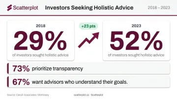
That transparency expectation reflects a deeper behavioral shift. McKinsey reports that the share of investors seeking holistic advice rose from 29% in 2018 to 52% in 2023. Clients want returns put in context — what does this mean for my goals, my timeline, my plan? Well-designed visuals are how advisors answer that question clearly, at every review.
Types of Financial Charts Advisors Use in Client Reports
Not all financial charts serve the same purpose. Advisors typically work with four main categories, each suited to a different kind of client conversation.
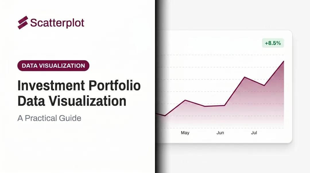
Portfolio Performance Charts
These are usually line charts showing investment returns over a defined period — month-to-date, year-to-date, or since inception. They belong in quarterly and annual review meetings, where the client's primary question is: how did we do?
A few things matter here:
- Include a benchmark so performance has context, not just a number in isolation
- Contextualize relative performance — a portfolio down 5% in a quarter where the index dropped 12% is a win, but the client won't see it that way without the comparison
- Focus the conversation on what the numbers mean for the client's goals, not what they are in absolute terms
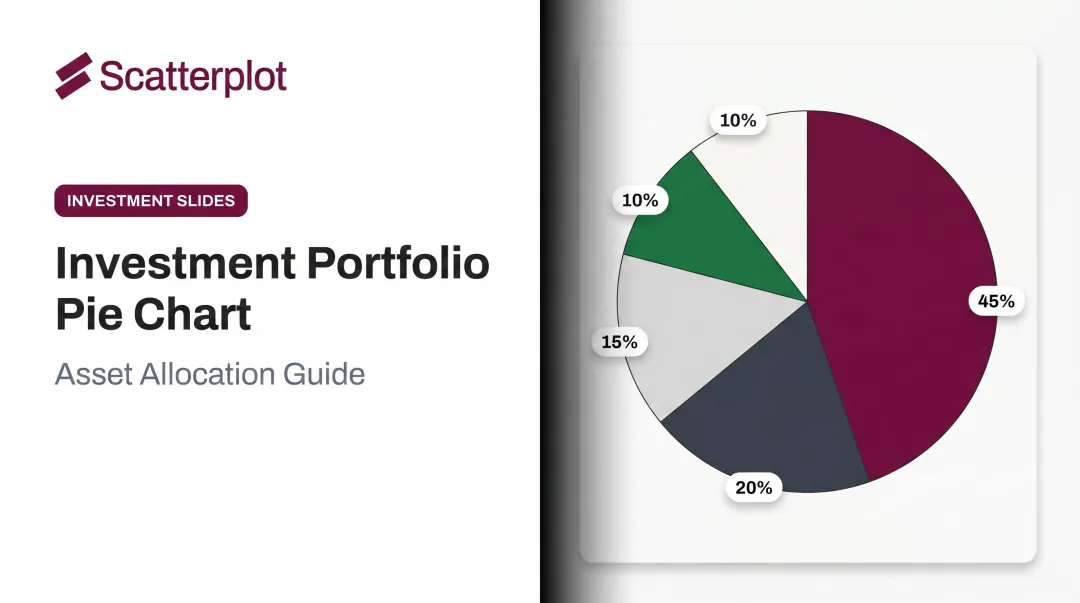
Asset Allocation Charts
Pie and donut charts showing portfolio composition — equities, fixed income, alternatives, cash — serve a specific purpose: confirming that current holdings still align with the client's stated risk tolerance and goals.
These charts are especially useful in two situations:
- When a portfolio has drifted from its target allocation due to market movement
- When a rebalancing conversation is on the agenda and you need a clear starting point
Keep pie charts to five slices or fewer. Beyond that, the visual loses clarity and the chart starts working against you.
Market Context Charts
Broader economic and market data — inflation trends, Fed rate movements, equity index returns, recession probability indicators — falls into this category. Where portfolio charts show what happened, market context charts explain why.
Morningstar's 14-chart framework for advisor client communication offers a practical reference here. The framework includes CPI year-over-year charts, Fed target rate probability charts, recession probability indexes, and market concentration data — all designed to give clients perspective on external conditions rather than just individual results.
Market context charts are most valuable during volatile periods, when clients need a reason — not just a result.
Financial Planning Projection Charts
The question clients care most about isn't how the market did — it's Will I be okay? Forward-looking charts address that directly: net worth over time, retirement income sources, after-tax spending trajectories.
These belong in financial planning meetings, not market update conversations. They're also the charts that most require personalization. A generic projection chart with no connection to the client's actual income, savings rate, or timeline doesn't build confidence — it raises questions. The more specific the inputs, the more the chart does its job.
How to Choose the Right Chart for Each Client Situation
Chart selection should be driven by the purpose of the meeting, not by what data happens to be available. Before pulling up a deck, ask one question: What is the single thing I want this client to understand or feel confident about after this meeting? The answer determines which charts belong in the room.
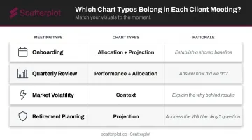
Matching Chart Type to Meeting Type
| Meeting Type | Primary Charts | Why |
|---|---|---|
| Onboarding | Allocation + projection | Establish a shared baseline |
| Quarterly review | Performance + allocation | Answer "how did we do?" |
| Market volatility | Context charts | Explain the "why" behind results |
| Retirement planning | Projection charts | Address the "Will I be okay?" question |
Avoid Over-Charting
More charts do not mean more clarity. Presenting too many visuals in a single meeting divides attention and — per cognitive load research — can leave clients less able to process any of it by the end. Aim for 3–5 focused charts per client interaction, each clearly connected to a specific talking point.
Client sophistication matters too. Some clients want granular data and detail; others need one chart with a clear headline. The chart type might stay the same — the framing changes. Advisors who know their audience calibrate both, which is what turns a routine review into a productive one.
There's also a key distinction between formats: charts in reports function differently than charts in live meetings. A report chart needs to be self-explanatory — labeled clearly enough that the client understands the key point without an advisor narrating. A meeting chart should prompt conversation and leave room for questions. Design accordingly.
How to Use Financial Charts Effectively in Client Reports: A Step-by-Step Guide
Effective use of financial charts follows a consistent sequence. The chart itself is only one part of the process — skipping the preparation or follow-through is where advisors lose client engagement.
Preparing Your Charts Before the Meeting
Preparation means three things:
- Select the right 3–5 charts for this specific client's situation — not a generic deck
- Confirm the data is current — a chart showing last quarter's performance in a retirement planning meeting creates confusion, not clarity
- Ensure branding is consistent — logo, colors, and required disclosures should be uniform across every visual
This step is where most of the time burden falls. Finding current data, rebuilding charts from scratch, reformatting for different clients — it adds up to hours before a single meeting takes place.
Platforms like Scatterplot address this directly: the platform delivers a library of daily-updated, fully branded, client-ready charts to advisors, so advisors skip both the data-sourcing and design work entirely.
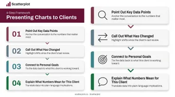
Framing and Presenting the Chart in the Meeting
Lead with the takeaway, not the visual. Before clicking to the chart, tell the client what it shows and why it matters. This prevents clients from drawing their own conclusions before the advisor has set the context — which is exactly what happens when you show the chart first and explain second.
When walking through the chart:
- Point out the key data points explicitly
- Call out what has changed since the last meeting
- Connect the visual back to the client's personal goals
- Explain what the numbers mean for this client's situation — don't just read them off the chart
Handling Questions and Closing the Conversation
Leaving time for client questions is not optional. It's where the most important engagement happens. Prompt questions explicitly — "Does this match how you expected things to look?" — rather than assuming silence means understanding. Silence often signals confusion or unspoken concern, not agreement.
Close cleanly: summarize the one takeaway from the chart, connect it to a next step or recommendation, and make the visual accessible after the meeting. A PDF leave-behind, a follow-up email, or client portal access all work. The goal is giving clients something to return to.
Best Practices for Financial Chart Reporting
Maintain visual consistency across every client touchpoint. Same color scheme, same fonts, same branding in every deck, every quarter. Inconsistency signals disorganization, even when the underlying data is accurate. Scatterplot applies branding globally across the entire chart library at setup, so every slide reflects the firm's identity without manual formatting.
Keep charts current. Stale market context charts can actively mislead clients about current conditions. Portfolio-specific charts should be refreshed before every meeting; market data charts should be updated at least monthly. The SEC's Division of Examinations has flagged outdated performance presentations as a compliance concern, giving this practice real regulatory weight.
Pair every chart with a guided talking point. The chart is the visual support for the message, not the message itself. Advisors who prepare a one-sentence takeaway for each chart deliver more consistent and confident presentations. Scatterplot includes pre-written talking points with each slide, so advisors arrive with both the visual and the framing ready to go.
Disclaimer
The content on this site is for informational and educational purposes only and does not constitute financial, investment, legal, or tax advice. It should not be relied upon as the basis for any investment decision. Past performance is not indicative of future results. Always consult a qualified financial professional before making any financial decisions.
Frequently Asked Questions
What are the different types of financial charts used in client reporting?
The four main categories are: portfolio performance charts (returns over time, typically line charts), asset allocation charts (portfolio composition by asset class), market context charts (economic and market data like CPI or Fed rate trends), and financial planning projection charts (forward-looking scenarios like retirement income or net worth trajectories). Each serves a different meeting purpose.
How often should financial advisors update client report charts?
Portfolio-specific charts should be refreshed before every client meeting. Market context charts should be updated at least monthly — using stale data undermines advisor credibility and, in some cases, raises compliance concerns. The SEC has flagged misleading or outdated performance presentations as an exam deficiency.
How many charts should be included in a client report or meeting?
Aim for 3–5 focused charts per client interaction. Quality and relevance matter far more than volume. Too many charts split client attention and reduce comprehension, especially as meeting length increases.
What makes a financial chart client-friendly?
Clear labeling, a simple visual hierarchy, a single takeaway per chart, and language that avoids jargon. Familiar chart types (line, bar, pie) work better than complex formats. For allocation charts, limit pie slices to five or fewer. The chart should be self-explanatory enough that a client grasps the key point without the advisor decoding it.
What is the difference between a portfolio performance chart and a market context chart?
Portfolio performance charts show what happened to the client's specific holdings. Market context charts show what happened in broader markets and the economy — inflation, interest rates, index returns. Used together, context charts explain the "why" behind portfolio results, turning a data review into a genuine client conversation.
How can financial advisors save time preparing charts for client reports?
The most effective approach is using a pre-built, regularly updated chart library rather than sourcing data and building visuals from scratch before every meeting. Platforms like Scatterplot deliver daily-updated, branded, client-ready charts that eliminate data-sourcing, chart-building, and deck-formatting work — freeing advisors for client-facing time.