Introduction
Most financial advisers know the frustration: you spend 90 minutes building a chart in Excel, the data looks right, and then you share it with a client who stares blankly and asks, "So what does this mean?"
The chart wasn't wrong. It just wasn't built well.
That problem is more common than most advisers realize. A 2024 YCharts survey of nearly 800 advisory clients found that 98% of high-value clients want their adviser's perspective on markets and the economy — yet only 64% of client conversations actually resonated, down from 70% the prior year. That gap lives in how information gets presented, not just what gets shared.
This guide walks through how to build a professional investment chart, from defining purpose to compliance review, including the design variables that separate credible visuals from amateur ones, and when it makes sense to stop building charts yourself entirely.
Key Takeaways
- Define the chart's narrative purpose before choosing a chart type or pulling data
- Match chart type to the story being told: line for trends, bar for comparisons, pie for allocation, scatter for risk-return
- Professional design requires deliberate choices: consistent branding, clear titles, benchmark overlays, labeled sources
- Compliance disclosures and "as of" dates belong directly on the chart, where clients will actually see them
- Advisers who need daily-updated, client-ready charts should weigh the real time cost of building and maintaining them in-house
How to Create a Professional Investment Chart: Step-by-Step
Excel, PowerPoint, and Tableau make chart creation accessible. Professional results require executing five deliberate steps in sequence. Skip one and the chart either misleads or loses credibility with the client reviewing it.
Step 1: Define the Chart's Purpose and Audience
Every professional investment chart should answer exactly one question. Performance over time. Asset allocation breakdown. Risk-return comparison. Sector exposure. Trying to answer two questions in the same chart almost always produces clutter.
Audience determines complexity:
- Internal investment committee — technical overlays, multiple data series, and annotated key events are appropriate
- Retail client — plain-language labels, a single data series, and a title that states the conclusion, not just the topic
The CFP Board requires CFP professionals to provide information "in a format that a client can reasonably be expected to understand." That standard applies directly to chart design.
Step 2: Source and Validate Your Data
The data source matters for both accuracy and compliance. Not all public data is freely reusable in client-facing materials.
| Source | Common Use | Reuse Notes |
|---|---|---|
| FRED (St. Louis Fed) | Rates, inflation, macro indicators | Attribution required; cannot alter FRED visualizations |
| Bureau of Labor Statistics | CPI, employment, wages | Public domain; cite BLS as source |
| World Bank | Global macro data | CC BY 4.0; attribution required |
| U.S. Treasury Fiscal Data | Debt, spending, revenue | Open API; no restriction |
| S&P Dow Jones Indices | Equity benchmarks | Licensed data — verify reuse rights |
| Bloomberg Indices | Fixed income benchmarks | Commercial license required |
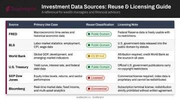
Before any chart enters a client deck, verify three things: the data is the most recent available, there are no gaps in the series, and units and time periods are consistent across all data series shown.
Step 3: Select the Right Chart Type and Time Frame
The time frame decision is just as consequential as the chart type itself. FINRA's Rule 2210 FAQ explicitly states that cherry-picking or excluding poorly performing realized holdings can be misleading — and that applies directly to start-date selection.
A long-term equity growth story typically requires a 10-year view. A volatility discussion may need a much shorter window. The rule: the time frame should serve the story the data actually tells, not the most favorable version of it.
Step 4: Apply Professional Design and Branding Standards
Core design elements that separate professional charts from hastily assembled ones:
- Chart title — state the insight, not just the data ("U.S. Equities Recovered Within 18 Months" beats "S&P 500 Performance")
- Color palette — 3–5 colors maximum, applied consistently across all charts in a deck
- Axis labels — legible font size, clear units, no abbreviations that require a decoder
- Benchmark overlay — include a relevant benchmark on every performance chart
- White space — remove decorative borders, gradients, and heavy gridlines that add nothing
- Firm logo and branding — FINRA requires retail communications to disclose the firm's name
One frequently overlooked check: print the chart in grayscale. Many advisers build charts that look polished on screen but become unreadable the moment a client prints them.
Step 5: Add Compliance Language, Data Attribution, and Final Review
Client-facing investment charts typically require:
- Data source citation — directly on the chart, not just in a separate footnote page
- "As of" date — placed on or immediately below the chart
- Past performance disclosure — standard language for any performance chart
- Gross and net performance — the SEC Marketing Rule requires that gross performance cannot appear without net performance shown with equal prominence
- Firm-required disclosures — confirm exact language with your compliance team
Before any chart goes into a presentation, run through this checklist:
- Verify data against the original source
- Confirm the title accurately reflects the content
- Check that all labels are readable at presentation size
- Confirm the chart answers exactly one question — not two
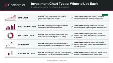
Choosing the Right Chart Type for Your Investment Message
Chart type is the most consequential visual decision in the process. The wrong chart for a given data set can mislead clients even when every data point is accurate.
Line charts are the default for time-series investment data — portfolio growth, index performance, yield trends. They become problematic when used for categorical data or any data set without meaningful continuity between points.
Bar and column charts are the strongest format for comparing returns across discrete periods, asset classes, or portfolios. Know the difference:
- Grouped bar charts — place related values side by side for direct comparison
- Stacked bar charts — display how components add up to a whole
Stacked bars can be visually compelling but are harder to interpret because non-baseline segments lack a common reference point.
Pie and donut charts work well for asset allocation breakdowns — with two firm constraints. Limit segments to five or fewer (Datawrapper automatically groups additional slices in its own pie chart tool), and never use them to show change over time. Angle and area judgments are less accurate than length comparisons.
Scatter plots are the right tool for risk-return analysis, typically plotting standard deviation on the x-axis against annualized return on the y-axis. They require more explanation with retail clients but are highly effective in institutional or adviser-to-adviser contexts.
Candlestick charts suit price action and technical analysis discussions. Keep them separate from client suitability conversations — they belong in technical contexts, not in allocation reviews.
With those options in mind, the professional default is clear: a two-dimensional, directly labeled line, bar, or scatter chart. Nielsen Norman Group recommends these formats for most explanatory visualizations — readers interpret them accurately without additional guidance, which is exactly what client-facing presentations require.
Key Design Variables That Determine Chart Professionalism
Technically accurate charts still fail clients when core design variables are ignored. Here's what separates a credible visual from a forgettable one.
Color and Contrast
Use a defined palette of 3–5 colors, applied consistently across every chart in a deck. Reserve one accent color for the primary data series — the thing you actually want the client to see. Default Excel color schemes signal low effort to experienced clients.
Contrast matters beyond aesthetics. NNGroup identifies contrast as a primary mechanism for directing attention and improving interpretation. If a client is looking at the wrong line first, the chart has already failed.
Annotation and Labeling
A chart title should state the takeaway. "Bloomberg U.S. Aggregate Bond Index Returns" describes the data. "Investment-Grade Bonds Returned 5.5% in 2023 Despite Rate Volatility" tells the client something.
Callout annotations for key events — a Federal Reserve rate decision, a market correction, a policy change — give clients context without requiring them to ask. These are the moments that make charts memorable rather than decorative.
Benchmark Inclusion
Every performance chart should include a relevant benchmark overlay. Without one, clients have no frame of reference, and sophisticated clients will notice its absence immediately. The SEC's 2024 risk alert specifically noted that benchmark comparisons should define the index and provide context — including whether dividends are reinvested.
Choose the benchmark deliberately. A broad index like the S&P 500 is meaningless context for a fixed income portfolio — it raises questions instead of answering them.
Source and Date Stamping
Place the data source and "as of" date directly on the chart — not in a footnote three slides later. Every chart should show:
- Where the data came from (provider name, index, or internal source)
- The date or date range the data covers
- Any relevant reinvestment or calculation assumptions
This is both a compliance best practice and a trust signal. A chart with a visible source and date looks credible. One without it looks assembled quickly.
Common Mistakes When Creating Investment Charts
Choosing Chart Type for Aesthetics Rather Than Data Structure
3D pie charts, dual-axis charts, and stacked area charts with many segments appear regularly in adviser presentations because they look sophisticated — but that visual polish comes at a cost. 3D graphics distort shape and alignment. Datawrapper notes that dual-axis charts can make unrelated data appear correlated at a quick glance, a problem that persists even when the underlying data is honest.
Truncated Axes, Inconsistent Scales, or Cherry-Picked Time Frames
Starting a y-axis at a value other than zero can make a modest change look dramatic. Selecting a time frame that begins at a convenient low point inflates apparent returns. These distortions often happen without intent, which makes auditing your own charts essential before they go to clients.
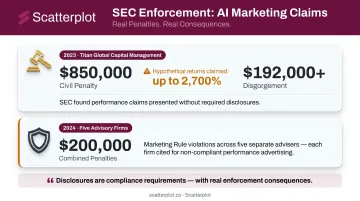
Skipping Compliance Review
The enforcement record here is real. In 2023, the SEC charged Titan Global Capital Management for misleading hypothetical performance charts showing annualized returns as high as 2,700%, resulting in:
- $850,000 civil penalty
- $192,000+ in disgorgement
In 2024, five additional advisers faced Marketing Rule charges for hypothetical performance content on their websites, with combined penalties of $200,000. Disclosures are compliance requirements — with real enforcement consequences attached.
When to Build Investment Charts In-House vs. Use a Pre-Built Platform
Not every adviser needs to build every chart from scratch. The decision comes down to three variables: customization requirements, time cost, and how frequently charts need to be updated.
Building in-house makes sense when:
- You need a highly specific, one-time chart for a particular client situation
- Your firm has a dedicated analyst or design resource
- You're incorporating proprietary data unavailable through third-party platforms
Using a pre-built platform makes sense when:
- You need a consistent library of market and economic charts updated on a regular basis
- Presentation prep is consuming time that belongs in client relationships
- You want slides that automatically carry your firm's logo, colors, and disclosures
If the second list describes your workflow, Scatterplot is worth considering. The platform delivers daily-updated investment visuals with your firm's logo, colors, and disclosures applied consistently across the entire slide library. Each subscription is $99/month (with a 7-day free trial) and includes guided talking points tied to each slide — reducing preparation time and the risk of presenting outdated context alongside current data.
If you're rebuilding the same market and economic charts before every client meeting, that time could go toward client relationships instead.
Disclaimer
The content on this site is for informational and educational purposes only and does not constitute financial, investment, legal, or tax advice. It should not be relied upon as the basis for any investment decision. Past performance is not indicative of future results. Always consult a qualified financial professional before making any financial decisions.
Frequently Asked Questions
What is the best chart type for presenting investment performance to clients?
Line charts are the standard for time-series performance data because they clearly show trends over time. Bar charts work better when comparing performance across discrete periods, such as calendar year returns. The right choice depends on whether you're showing a trajectory or a comparison.
What data should be included in a professional investment chart?
At minimum: the primary data series, a relevant benchmark, clearly labeled axes, an "as of" date, and the data source. Each additional data series should only appear if it directly supports the chart's message. More series rarely improves clarity.
How do I add disclosures and compliance language to investment charts?
Client-facing charts typically require past performance disclaimers, data source citations, and any firm-required disclosures. The specific language varies by registration status, firm type, and how the material is classified. Consult your compliance team before distributing performance or benchmark charts.
What tools do financial advisers use to create professional investment charts?
Options range from manual tools like Excel, PowerPoint, and Tableau for custom one-off charts, to purpose-built platforms like Scatterplot that deliver pre-built, daily-updated, branded visuals designed specifically for adviser-client communication.
How often should investment charts be updated for client presentations?
Any chart used in a client meeting should reflect the most current available data. Market and economic charts should ideally be updated daily or weekly. Presenting outdated charts is both a credibility risk and, in some contexts, a compliance concern under FINRA and SEC marketing standards.
How can advisers use income projection charts to illustrate retirement income goals?
Income projection charts make yield math concrete for clients. At a 4% annual yield, roughly $300,000 generates $12,000 per year; at 6%, that drops to $200,000. Showing these scenarios visually turns an abstract calculation into a clear, client-led conversation.