Introduction
Financial markets generate enormous volumes of data every single day. The challenge for wealth advisers isn't accessing that data — it's translating it into something clients can actually act on.
Spreadsheets don't answer "am I going to be okay?" A well-chosen chart can — in the time it takes a client to glance at a slide.
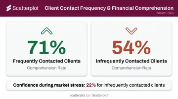
A 2024 YCharts survey of nearly 800 advised clients found that 75% switched or considered switching advisers in 2023 — and clients who were contacted infrequently had only 22% confidence in their financial plan during market stress. How often you communicate matters, but so does how clearly you communicate when you do.
That's what this guide is for. It covers 8 practical visualization types every wealth adviser should know: when to use each one, what story it tells in a client meeting, and how to pick the right chart for the right audience.
Key Takeaways
- Line charts are the default for long-term portfolio and market trends — readable by any client.
- Candlestick charts show short-term price action; reserve them for investment-literate clients.
- Heatmaps make sector performance and correlations scannable without reading a single number.
- Scatter plots visualize the risk/return trade-off across portfolios using efficient frontier logic.
- Waterfall charts are the clearest way to explain performance attribution — where returns came from.
- Chart choice should follow the question being answered, not just the data available.
Why Visualizing Financial Market Data Matters
The SEC's investor literacy research found that 57.3% of investors who didn't read statutory prospectuses cited complexity as the primary reason — and investors consistently prefer clear, concise disclosures with charts, graphs, and bullet points over dense narrative text.
That same cognitive friction appears in every client meeting where an adviser walks through a performance table line by line. Dense data creates overload; visuals reduce it by encoding information through color, shape, and position — forms the brain processes faster than raw numbers.
The numbers make the case:
- Clients contacted frequently understood 71% of what advisers covered
- Clients contacted rarely understood just 54% of the same content (YCharts, 2024)
- Better comprehension means fewer misunderstandings about portfolio positioning and more time on strategy
That comprehension gap has a direct cost on the adviser's side too. Kitces Research found lead advisers spend only 8.8 hours per week in client meetings — roughly 20% of their work week. Visuals that communicate faster don't just help clients understand more. They protect that limited time.
8 Ways to Visualize Financial Market Data
Line Charts
Line charts are the foundational tool for any question about change over time. One metric, one time axis, immediately readable by clients regardless of financial background.
Best adviser use cases:
- Long-term equity index performance (10- or 20-year views)
- A client's portfolio growth since inception
- Interest rate or inflation trend lines
- Overlaying two indices to show relative performance
The real power comes from annotations. The Federal Reserve's Financial Stability Reports model this well — recession shading, labeled rate events, and source notes that explain exactly what the viewer is seeing. Applying the same logic to a client chart — "here's the 2020 COVID selloff, here's how your portfolio recovered" — turns a data line into a story the client can actually follow.
One caution: line charts show a single data point (usually closing price) per period. They smooth over daily volatility by design. For conversations about short-term price behavior, a different chart type is more appropriate.
Candlestick Charts
Candlestick charts encode four data points per period: open, high, low, and close. The body shows the open-to-close range; the wicks show the high and low extremes. According to CME Group, a green bar generally indicates the close was higher than the open; red indicates the opposite.
When advisers use them:
- Discussing a specific stock's recent price behavior
- Explaining why a holding looks constructive or concerning near a support level
- Walking through short-term volatility with an engaged, investment-literate client
The honest caveat: candlestick charts can overwhelm clients who are newer to investing. They also emphasize short-term price movements in ways that can conflict with a long-term planning message. Use them selectively — and when you do, pair with a one-sentence explanation of what the wicks mean.
Bar and Column Charts
Bar and column charts answer categorical questions: which asset class performed best this quarter, how do S&P 500 sector returns compare year-to-date, what's the GDP growth differential between regions?
They're the clearest visualization when the client question isn't "what changed over time" but "how do these things compare right now."
Practical applications:
- Year-to-date performance across major asset classes
- S&P 500 sector returns side by side
- Quarterly GDP growth by region
- Fee comparisons across share classes
Grouped bars show subcategories within each column; stacked bars show composition and total simultaneously. Both work well, but the key best practice is restraint: keep bar counts between 6 and 10 maximum. Beyond that, the chart becomes a table in disguise.
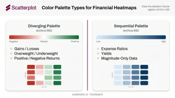
Heatmaps
Heatmaps encode numerical values through color intensity across a grid. The result: clients can identify patterns and outliers at a glance, without reading a single number.
Two high-value use cases for advisers:
Sector performance heatmap — Monthly or quarterly returns across all 11 S&P 500 sectors. Clients immediately see which areas have led or lagged without needing a legend walkthrough.
Correlation matrix — How different asset classes move relative to each other. This makes diversification conversations concrete. "You can see here that these two holdings tend to move together" lands differently than explaining a 0.82 correlation coefficient.
Color scale selection matters more than most advisers realize. Data visualization researcher Stephen Few recommends diverging palettes (e.g., red to white to green) when values move away from a meaningful midpoint like zero — ideal for gains/losses, overweight/underweight, or positive/negative returns. Sequential palettes (light to dark) work better for magnitude-only data like expense ratios or yields.
Scatter Plots
Scatter plots place each asset, security, or portfolio as a dot on two axes — typically risk (volatility or standard deviation) on the x-axis and return on the y-axis. This is the visual language of modern portfolio theory, grounded in Harry Markowitz's 1952 "Portfolio Selection" and the efficient frontier concept.
Adviser use cases:
- Plotting current holdings to show how they cluster by risk profile
- Demonstrating why adding a lower-correlation asset improves the portfolio's position on the frontier
- Comparing potential allocations before recommending a change
Dot sizing adds a third dimension — weight by portfolio allocation or market cap — without cluttering the chart. Label the key positions clients will recognize. Keep assumptions visible; forward-looking estimates on a scatter plot need to be clearly marked as such.
Waterfall Charts
Waterfall charts don't get used as often as they should. They show how individual components — positive and negative — cumulatively build from a starting value to an ending value. Each bar floats from where the previous one left off.
The primary advisory application: performance attribution.
A waterfall chart shows a client exactly how each asset class or position contributed to (or detracted from) performance over a period. The CFA Institute defines performance attribution as identifying sources of portfolio performance and manager decisions. A waterfall translates that into something a client can read at a glance:
Beginning value → equity contribution → fixed income contribution → fees → withdrawals → ending value
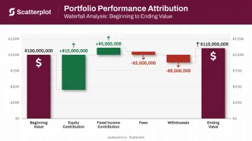
Clients who tune out a return decomposition table typically engage with a waterfall because each bar has a clear label and direction — the abstraction disappears.
Other use cases:
- Retirement balance breakdowns by contribution source
- Economic factor decompositions
- Any total built from distinct, additive parts
Histograms and Return Distribution Charts
Histograms show how often returns fell within specific ranges — placing historical outcomes into buckets and plotting their frequency. The shape of the distribution tells a story that average return alone never could.
Why this matters for advisers:
Average return is a summary statistic. It hides how often losses occurred, how deep they went, and whether the distribution is symmetric or skewed. Mandelbrot's 1963 paper on speculative price changes demonstrated that extreme outcomes occur more frequently than a normal bell curve would predict — what quantitative analysts call fat tails.
Use histograms to:
- Set realistic expectations before volatile periods
- Show clients that short-term losses are a normal feature of long-term equity investing
- Illustrate the difference between a symmetric return distribution and one with fat downside tails
One important warning from the research: chart scaling significantly affects perceived risk. Huber et al. found that a narrower y-axis made the same volatility appear more severe. Keep scales consistent when comparing across securities or time periods.
Annotated Area Charts
Area charts are line charts with the space below the line filled in. Stacked versions show how portfolio composition has evolved — each layer represents a different asset class or account type.
Two adviser applications:
Allocation drift over time — A stacked area chart showing how a client's target allocation has been rebalanced across years demonstrates active management visually. Vanguard's target-date glide path (shifting from roughly 90% equities at age 20 to 30% by age 72) is one well-known institutional example of this format in action.
Annotated single-area chart — Add labels for major market events directly on the client's portfolio history: the 2020 COVID selloff, the 2022 rate hike cycle, rebalancing points. The annotation does the narrative work.
Without annotations, an area chart is just another trend line. Add labels for the events clients remember, and the chart becomes the centerpiece of a client conversation rather than a backdrop to one.
How to Choose the Right Visualization for Client Meetings
Match the Chart to the Question
| Client question | Best chart type |
|---|---|
| What changed over time? | Line chart or annotated area chart |
| What happened inside a trading period? | Candlestick chart |
| Which category is bigger or better? | Bar or column chart |
| Where are many values high or low at once? | Heatmap |
| Is this return worth the risk? | Scatter plot |
| What drove the change? | Waterfall chart |
| How often did this outcome occur? | Histogram |
| How did the allocation mix shift? | Stacked area chart |
Calibrate to Your Audience
Financial graph literacy varies significantly by education and investment experience. A client who spent 20 years in finance can navigate a scatter plot with unlabeled axes. A client receiving their first annual review cannot.
- Less experienced clients: annotated line charts, simple bar comparisons, area charts with clear labels
- Investment-literate clients: candlestick charts, scatter plots, correlation heatmaps
Avoid Over-Visualizing
Using five different chart types in a single client meeting fragments attention. The most effective adviser presentations use 2–3 consistent chart types per meeting, each reinforcing the same strategic narrative. When every slide introduces a new chart format, clients spend cognitive energy decoding visuals rather than engaging with your recommendations.
From Raw Data to Client-Ready Visuals
Most wealth advisers already know which chart types work best. The real constraint is time.
Sourcing current market data, building the chart, formatting it consistently, adding disclosures, and writing talking points — for a single quarterly review deck — can consume hours that would be better spent on clients. Kitces Research found lead advisers average 43 hours per week, with only 8.8 of those hours in actual client meetings. Preparation shouldn't eat the rest.
Scatterplot was built specifically to solve this problem. Founded by Sanjeev Pati, CFA, the platform delivers a daily-updated library of client-ready market visuals — covering markets and economic indicators — fully branded with an adviser's logo, colors, and disclosures.
The process is straightforward:
- Choose a template from the library of professionally designed slides
- Preview and add to deck — decks update automatically, no manual data work required
- Present or download as PDF — directly from the platform
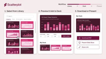
Rather than rebuilding the same charts from scratch each quarter, advisers pull presentation-quality slides with guided talking points already included. That time goes back into client conversations — where it makes a measurable difference.
At $99/month with a 7-day free trial, the library is available to explore before the next quarterly review cycle.
Disclaimer
The content on this site is for informational and educational purposes only and does not constitute financial, investment, legal, or tax advice. It should not be relied upon as the basis for any investment decision. Past performance is not indicative of future results. Always consult a qualified financial professional before making any financial decisions.
Frequently Asked Questions
What is the best chart type for showing long-term market trends to clients?
Annotated line charts are the most effective. They're readable at any experience level and become far more powerful when labeled with major market events — recessions, rate cycles, recovery points — giving the trend line a clear narrative context.
How do heatmaps help communicate portfolio risk to clients?
Heatmaps make sector exposure and correlation patterns scannable in seconds. Rather than asking clients to interpret a table of numbers, a well-designed heatmap lets them immediately see where concentration exists or where diversification is working.
What is the difference between a line chart and a candlestick chart?
Line charts show a single data point (typically closing price) over time and work best for trend discussions. Candlestick charts encode four data points per period — open, high, low, close — and are better suited for explaining short-term price behavior with clients who have investment experience.
Can financial advisers create professional market data visualizations without coding skills?
Yes. Platforms like Scatterplot deliver pre-built, automatically updated financial chart libraries designed specifically for advisers — no coding, no manual data sourcing, and no design work required. Slides arrive fully branded and ready to present.
What is a waterfall chart and when should advisers use it?
A waterfall chart shows how individual components combine to form a total — making it the clearest tool for performance attribution conversations. When clients want to understand which positions helped or hurt returns in a given period, it answers that question more directly than a data table.