Introduction
Most advisers know the feeling: it's the night before a client review, and you're still hunting down market data, rebuilding charts you've built a dozen times before, and trying to make a slide deck look professional enough to support the conversation you've been planning for weeks.
The problem isn't the data — it's the process. Raw numbers, return tables, and allocation percentages don't communicate on their own. Without visual context, clients struggle to interpret what their portfolio is actually doing and why.
Investment portfolio data visualization is how advisers close that gap. It translates complex financial data — performance trends, risk exposure, allocation breakdowns, and drawdown history — into charts and dashboards that clients can read and respond to quickly.
This guide covers the chart types that work best for portfolio communication, which metrics are worth visualizing, and what separates a presentation that builds client confidence from one that just fills time.
Key Takeaways
- Portfolio visualization translates returns, allocations, and risk data into charts clients can actually interpret.
- Different chart types serve different purposes — line, bar, pie, treemap, and KPI cards each communicate distinct information.
- The most useful metrics to visualize include allocation breakdown, benchmark comparisons, risk indicators, income data, and market context.
- Client-facing visuals require simplicity, consistent branding, and a guided narrative — not just accurate data.
- Pre-built, daily-updated slide libraries reduce prep time and keep visuals current for every client meeting.
Why Investment Portfolio Data Visualization Matters
The Comprehension Gap
Numbers alone don't tell a story. A client seeing a 7.3% return next to a benchmark return of 8.1% has data — but not context. They don't know whether that gap is significant, whether it reflects deliberate risk management, or whether it should concern them.
Research from Kitces confirms that visual formats outperform text-based formats on attention, agreement, and retention in adviser-client communication contexts. A separate study of surrogate investors found that visual presentations increased holistic understanding of performance and influenced allocation decisions more than descriptive text alone.
Charts don't just make information prettier — they give clients the context to understand it and the confidence to act on it.
The Time Problem
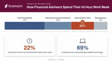
Preparation time is a real cost. According to Kitces Research (2019), the average financial adviser works roughly 43 hours per week — with client meeting prep and administrative work claiming a substantial share. The numbers tell the story:
- 22% of adviser time goes to administrative tasks, per a Cerulli report
- 69% of advisers said they could use existing technology more effectively to improve efficiency
- Chart-building and deck prep sitting inside that administrative load directly crowd out time for client relationships and planning work
Credibility Is Visual
Reclaiming that time also makes consistency possible — and consistency is what builds credibility. Clients who see the same quality of presentation across every meeting, with clear labels, firm branding, and current data, develop confidence in the relationship over time.
Inconsistent formatting — mismatched colors, unlabeled axes, outdated figures — undermines that confidence even when the underlying advice is sound. Presentation quality signals preparation quality.
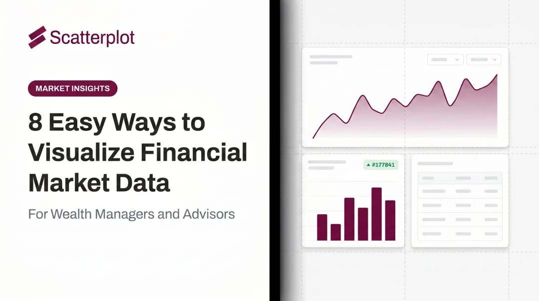
Key Chart Types for Investment Portfolio Visualization
Choosing the wrong chart type is one of the most common visualization mistakes. The data might be accurate, but if the format doesn't match the message, clients will miss the point.
Line Charts
Line charts are the standard for showing how a portfolio has performed over time. The X-axis represents time — daily, monthly, quarterly, or annual intervals — and the Y-axis represents value or return percentage.
- Single-line: Best for showing total portfolio value trajectory
- Multi-line: Best for benchmark comparisons (portfolio vs. S&P 500, for example) or comparing asset classes side by side
The strength of a line chart is continuity — clients can see the full arc of performance, including drawdowns and recoveries, not just where the portfolio stands today.
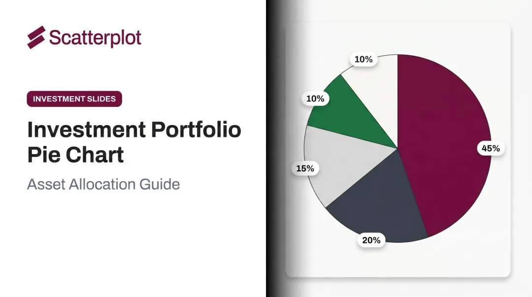
Pie and Donut Charts
Pie and donut charts work well for showing portfolio allocation at a point in time — how assets are distributed across equities, fixed income, cash, and alternatives. They're immediately intuitive for most clients.
The limitation: Kitces recommends capping pie charts at five slices. More than that, and the chart becomes hard to read. When a portfolio has many small holdings or sector exposures, a bar chart or treemap is the better choice.
Bar and Column Charts
Bar charts are the go-to format when you need precise comparisons across categories. Foundational data visualization research by Cleveland and McGill (1984) established that people judge length more accurately than area or angle — which makes bars more reliable than pie slices for comparison tasks.
Use column charts for:
- Year-over-year performance comparisons
- Sector returns across a period
- Dividends received by holding
- Historical highs and lows
Treemaps
Treemaps show portfolio composition as a grid of sized blocks — each block proportional to the holding's or sector's weight in the portfolio. At a glance, advisers can spot where capital is concentrated without scrolling through a holdings table.
The caveat: as position sizes approach zero, small blocks become nearly impossible to label or read. Nielsen Norman Group notes that treemaps are poor for precise comparison because people judge area less accurately than length. Use them for a high-level composition view, not for detailed analysis.
KPI Cards
Once clients understand how their holdings are composed, they still need one anchoring number before the conversation can move forward. KPI cards serve that role — quick-reference panels at the top of a dashboard or presentation showing total portfolio value, annualized return, yield, unrealized gains/losses, and dividends in a single glance.
They answer the first question most clients have walking into a review: Where do we stand? Once that's answered, clients are more receptive to the detailed charts that follow.
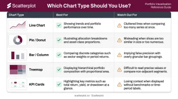
Quick Reference: Which Chart to Use
| Chart Type | Best For | Watch Out For |
|---|---|---|
| Line Chart | Performance over time, benchmark comparisons | Cluttered multi-line charts with 4+ series |
| Pie / Donut | Allocation snapshot at a point in time | More than 5 slices — use a bar chart instead |
| Bar / Column | Category comparisons, year-over-year returns | Misleading y-axis truncation |
| Treemap | High-level concentration view | Small positions that become unreadable |
| KPI Cards | At-a-glance portfolio summary | Overloading with too many metrics |
Essential Portfolio Metrics to Visualize
Allocation Breakdown
Allocation visualization covers three dimensions that each surface different risks:
| Dimension | What It Shows |
|---|---|
| Asset class | Equities vs. fixed income vs. cash vs. alternatives |
| Sector | Technology, healthcare, financials, energy, etc. |
| Geography | Domestic vs. international, developed vs. emerging markets |
Text-based reports often obscure concentration. A chart showing 40% of a "diversified" portfolio sitting in technology stocks makes that risk visible instantly.
Portfolio Performance vs. Benchmarks
Raw returns have no context without a comparison point. Visualizing portfolio returns against a relevant benchmark — whether a blended index or a custom composite — tells clients whether performance reflects market conditions or portfolio-specific decisions.
Two regulatory frameworks shape what periods to display: the CFA Institute GIPS Standards require at least five years of annual performance building to ten, while SEC Marketing Rule guidance specifies 1-, 5-, and 10-year periods for performance advertising.
A line chart overlay or side-by-side column chart across these standard periods gives clients the most complete picture.
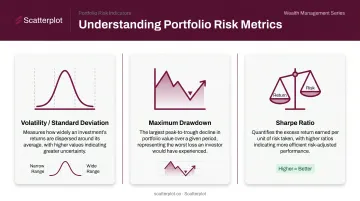
Risk and Diversification Indicators
Three metrics are worth visualizing for most client conversations:
- Volatility (standard deviation): Shows how widely returns have varied around the average. Higher standard deviation means a wider range of outcomes.
- Maximum drawdown: The largest peak-to-trough decline before a new high is reached. Particularly useful during volatile markets — showing clients the historical depth of drawdowns, and recoveries, puts current dips in context.
- Sharpe ratio: Risk-adjusted return. A higher Sharpe ratio indicates better historical return per unit of risk taken.
An investment style matrix — plotting holdings by market cap and valuation (growth vs. value, large vs. small cap) — adds another useful dimension for clients who want to understand the character of their portfolio beyond sector exposure.
Income and Dividends
A bar chart comparing dividend yield against unrealized gains or losses across holdings quickly identifies which positions are pulling income versus which are driving appreciation. This directly supports rebalancing conversations and helps clients understand how their income needs are being met.
Annual dividend totals work naturally as a KPI card — a clean, single-number summary that resonates with income-focused clients.
Market and Economic Context
Client results never exist in isolation. Pairing portfolio charts with broader market context helps clients understand why their portfolio behaved a certain way — and reduces emotional reactions to short-term volatility. Useful context visuals include:
- Equity market trends: Major index returns over the review period
- Interest rate movements: Fed policy shifts and their effect on fixed income
- Inflation data: CPI trends that contextualize real purchasing power
Vanguard's behavioral coaching research finds that helping clients separate emotions from investment decisions is among the most tangible value an adviser delivers — and visual context is a direct tool for doing that.
Best Practices for Client-Ready Portfolio Visuals
Match Chart Type to the Story
A quick decision guide:
- "How has this changed over time?" → Line chart
- "How do these compare?" → Bar or column chart
- "What does the whole look like?" → Pie or donut chart
- "Where do we stand right now?" → KPI card
- "How concentrated is this?" → Treemap
Picking the chart that fits the data format rather than the message is how you end up with technically correct visuals that confuse clients anyway.
Prioritize Simplicity Over Comprehensiveness
Client-facing visuals are not internal analytical dashboards. One clear chart with one clear takeaway is more persuasive than a multi-metric panel that requires a five-minute explanation.
Keep to a manageable number of visuals per slide or page. Remove anything that doesn't directly support the conversation you're trying to have. If a metric isn't something you plan to discuss, it doesn't belong in the client deck.
Maintain Branding and Consistency
Consistent use of firm colors, logo placement, and disclosure language builds professional credibility across every client interaction. Inconsistent formatting — different fonts, color schemes, or layouts across decks — signals carelessness, even when the data itself is correct.
Platforms like Scatterplot address this directly: advisers configure their logo, brand colors (specified by HEX or RGB values), and disclosure language once, and every slide in the library reflects those settings automatically. There's no manual reformatting between meetings.
Keep Visuals Current
Stale charts are worse than no charts. An outdated performance chart shown in a client meeting signals either carelessness or a disconnect from current market conditions — both erode trust.
Manually refreshing charts before every review takes time most advisers don't have. Scatterplot's daily-updated slide library solves this: charts refresh automatically as new data arrives, already formatted with the adviser's branding. Preparation time shifts from data hunting and deck-building to the conversation itself.
The goal: walk into every client meeting with charts that reflect what happened yesterday — not last quarter.
From Charts to Client Conversations
Pair Every Visual with a Talking Point
A chart without context leaves interpretation to the client — which can generate confusion or unnecessary anxiety. Each visual in a client presentation should come with a concise talking point that covers:
- What the chart shows
- What it means for the client's situation
- What action, if any, is recommended
That framework reduces guesswork and keeps the conversation focused. Scatterplot builds guided talking points directly into its slides, so the narrative structure is already in place — advisers personalize it for each client's circumstances rather than constructing it from scratch.
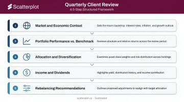
Structure a Client Review Presentation
A logical quarterly review flow gives clients a clear narrative arc:
- Market and economic context — Set the stage. What happened in markets this period?
- Portfolio performance vs. benchmark — How did the portfolio perform relative to expectations?
- Allocation and diversification — Is the portfolio positioned as intended?
- Income and dividends — Are income goals being met?
- Rebalancing recommendations — What, if anything, needs to change?
This sequence moves clients from broad context to specific action, which mirrors how most people naturally process information.
Reduce Prep Time Without Sacrificing Quality
Advisers who build charts manually for each client repeat the same tasks every review cycle. That time has a real opportunity cost: every hour spent reformatting a bar chart is an hour not spent on planning, prospecting, or deeper client conversations.
Pre-built, branded slide libraries shift that workflow entirely. Scatterplot offers this at $99/month (with a 7-day free trial) — instead of assembling a deck from scratch, advisers select the slides that fit the client's situation, review the talking points, and step into the conversation. Charts arrive current, branded, and ready to use.
Disclaimer
The content on this site is for informational and educational purposes only and does not constitute financial, investment, legal, or tax advice. It should not be relied upon as the basis for any investment decision. Past performance is not indicative of future results. Always consult a qualified financial professional before making any financial decisions.
Frequently Asked Questions
What are common investment portfolio allocation rules like 70/30?
The 70/30 split — 70% equities, 30% bonds — is a starting point for moderate-to-aggressive investors, similar to the widely studied 60/40 model. Allocation visuals help advisers show clients where their specific portfolio sits relative to these benchmarks and explain why deviations make sense given their goals and time horizon.
What is the best investment portfolio analysis tool?
It depends on the use case. Internal analysis platforms like Bloomberg or Morningstar are built for deep portfolio analytics. For wealth managers who need daily-updated, client-ready visuals without manual chart-building, purpose-built platforms like Scatterplot serve a different function — presentation and communication rather than analysis.
What charts are best for showing portfolio performance to clients?
Line charts work best for performance over time, bar charts for benchmark comparisons across periods, and KPI cards for at-a-glance metrics. Simplicity and clear labeling matter more than chart sophistication in client-facing contexts.
How often should investment portfolio visuals be updated?
For regular client meetings, visuals should reflect current data — more current is always preferable. The SEC Marketing Rule restricts performance advertising to data ending no earlier than the prior calendar year-end, but stale visuals in client reviews can erode trust and distort the conversation.
What metrics should be included in a client portfolio presentation?
The core set: total portfolio value and returns, performance vs. benchmark, asset allocation breakdown, risk indicators (volatility or drawdown), and income/dividends. Market context charts that frame why the portfolio performed as it did complete the picture.
How can financial advisers save time on portfolio reporting?
Use pre-built, auto-refreshing visual libraries with branding already applied rather than building charts from scratch. Keep data preparation separate from client communication — prep time should go toward the conversation, not the charts.