Introduction
Picture this: a client calls on a Thursday afternoon, rattled by headlines about Fed rate expectations shifting. You open your deck — and it's built on data from last Friday. The conversation that follows is full of caveats instead of clarity.
This is the credibility gap many financial advisers live with. Markets move daily. CPI drops monthly. The Fed holds eight scheduled meetings per year. But client presentations still often rely on manually rebuilt slides that lag behind the data by days or weeks.
Real-time data visualization tools close that gap. They connect live market and economic data to client-ready visual formats automatically, so advisers walk into every meeting with current charts instead of outdated decks.
This post covers:
- The core benefits of real-time visualization for financial advisers
- Which chart types matter most for financial analysis
- How these tools transform client communication
- The real cost of building visuals manually
- What to look for when choosing a platform
Key Takeaways
- Real-time visualization tools auto-refresh charts from live data feeds — no manual rebuilding required.
- The biggest adviser benefit is client communication: clearer conversations, faster trust, stronger presentations.
- Annotated line charts, multi-metric dashboards, and heatmaps are the most useful formats for client-facing work.
- Advisers spend nearly 22% of their time on admin tasks — automating chart prep frees that time for clients.
- Look for daily updates, branded output, and ease of use — not just feature complexity.
Why Real-Time Data Visualization Matters for Financial Analysis
The Problem With Static Reports
A chart built on Monday can tell a misleading story by Friday. That's not hyperbole — it's the reality of how fast adviser-relevant data moves.
The Fed updates rates at eight scheduled meetings per year. CPI publishes monthly. VIX and S&P 500 data shift every trading day. A static quarterly report misses multiple material changes between the time it's built and the time a client reads it.
The traditional workflow compounds this: export data from a terminal, reformat in Excel, rebuild charts in PowerPoint, apply branding, update disclosures. By the time the deck is client-ready, some of the underlying data has already moved.
The Decision-Making Advantage
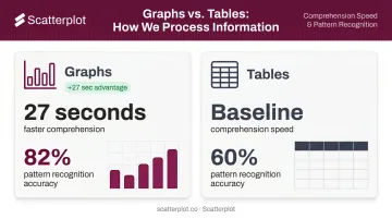
A peer-reviewed study found participants extracted information from graphs 27 seconds faster than from equivalent tables, with accuracy rates of 82% vs. 60% in favor of graphs for pattern recognition tasks. That speed advantage matters in client meetings — time spent explaining a table is time not spent discussing strategy.
When advisers can show current trends — yield curve shifts, sector rotation, inflation readings — visualized in the moment, they answer client questions with facts rather than qualifications.
Advisers who present live, current data don't hedge their answers. They point to the chart.
The Risk Communication Angle
Real-time heatmaps and correlation charts surface anomalies that monthly snapshots simply miss:
- Sudden volatility spikes that appear and resolve within days
- Correlation breakdowns between asset classes signaling regime shifts
- Sector-level stress building gradually before it makes headlines
Presenting these proactively — before clients encounter alarming news — shifts the adviser's role from reporter to interpreter. That's where client trust is built, particularly during volatile markets.
The Most Effective Chart Types for Financial Analysis
Not all chart types serve client communication equally. Complexity that impresses data teams often confuses clients. The goal is choosing the simplest format that makes the decision or trend clear — and the right starting point depends on what you're trying to show.
Annotated Line Charts and Timelines
Line charts are the foundation of financial storytelling. They show performance over time, interest rate cycles, and economic trends in a format most clients can follow without a finance background.
The upgrade comes with annotations. Marking Fed decisions, recession periods, tax-law changes, or portfolio rebalancing events directly on the chart transforms a simple trend line into a guided narrative. Research on information visualization confirms that annotations improve comprehension, memorability, and attention guidance — they reduce cognitive load by connecting "what happened" to "why the line moved."
Practical applications for annotated line charts include:
- Rate-cycle charts marked with FOMC decision dates
- Portfolio performance timelines with rebalancing events noted
- Economic trend lines flagging recession periods or tax-law changes
For advisers, this context turns a static chart into a conversation.
Multi-Metric Dashboards
Quarterly review meetings often require clients to hold multiple data points in mind at once — equity returns, bond yields, inflation, GDP growth. A single dashboard that consolidates these into one view removes the mental juggling.
This format is particularly effective for:
- New client onboarding (big-picture orientation)
- Annual or semi-annual portfolio reviews
- Volatile periods when clients need reassurance across asset classes
Heatmaps and Scatter Plots
These formats serve more analytical conversations rather than general client updates:
- Heatmaps reveal correlations and seasonal patterns across asset classes — useful when discussing diversification or explaining portfolio construction decisions
- Scatter plots illustrate relationships between variables (earnings growth and stock performance, for example) — useful for supporting an investment thesis without requiring clients to process raw data
Across all formats, NN/g's chart guidance makes the case simply: select chart types by the viewer's task, not visual sophistication. The chart that makes a client's decision clearest is always the right one.
How Real-Time Visualization Transforms Client Communication
From Backward-Looking Updates to Forward-Looking Conversations
When a chart was updated that morning, an adviser can say "here's what markets did this week and what it means for your portfolio." When it was built last week, the conversation defaults to "here's what we saw last month."
That difference in currency — days versus weeks — has a measurable effect on client confidence.
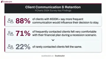
YCharts' 2024 advisor-client survey found 88% of clients with over $500,000 in assets said more frequent or personalized communication would influence their decision to stay with their adviser. During simulated recession scenarios, 71% of frequently contacted clients felt very comfortable with their financial plan — compared to just 22% of rarely contacted clients.
Current visuals are a delivery mechanism for that frequency and personalization.
Bridging the Client Literacy Gap
Most wealth management clients are not financial professionals. A chart showing a yield curve inversion means little to someone who's never heard the term. But a clean annotated timeline showing the same data — labeled in plain language, with key events marked — opens a conversation.
Design quality directly determines whether that conversation happens. Three elements make charts accessible rather than alienating:
- Clear legends that define terms without requiring financial background
- Color-coded performance indicators that communicate direction at a glance
- Logical chart organization that guides the eye rather than overwhelming it
These aren't aesthetic choices — they're what allow advisers to have substantive conversations without losing clients in jargon.
The Branded Presentation Dimension
Every visual a client sees is a brand touchpoint. Generic charts pulled from data terminals signal that the adviser is working with commodity tools. Branded charts with the firm's logo, colors, and compliance disclosures signal that the adviser treats presentation as seriously as the underlying advice.
Scatterplot was built to solve exactly this problem. The platform delivers daily-updated, fully branded investment visuals — including guided talking points — designed specifically for wealth managers and financial advisers.
Advisers can customize slides with their logo, HEX color codes, and firm-specific disclosures, with branding applied automatically across the entire library. The result is a consistent, professional presentation at every client touchpoint, without manual formatting work between meetings.
The Hidden Cost of Building Financial Visuals Manually
What the Workflow Actually Costs
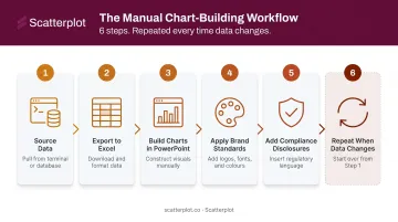
The manual process for building a client presentation typically involves:
- Sourcing data from financial terminals or third-party platforms
- Exporting to Excel and cleaning the dataset
- Building charts in PowerPoint or Excel
- Applying brand standards (fonts, colors, logos)
- Adding compliance disclosures
- Repeating the process whenever data changes
Not one of those steps moves the needle for clients. All of them consume time that could go toward portfolio analysis, client outreach, or business development.
Kitces research found lead advisers work approximately 43 hours per week but spend only 8.8 hours in actual client meetings. Cerulli data shows advisers allocate nearly 22% of their time to administrative tasks. Manual visual prep sits squarely in that 22%.
The Opportunity Cost Is Capacity
That time loss compounds hardest for solo practitioners and small advisory teams, where the inefficiency is structural. There's no dedicated operations staff to absorb the deck-building work. Every hour spent rebuilding charts is an hour that doesn't become a client conversation, a prospect meeting, or a referral follow-up.
InvestmentNews reported that 38% of advisers say they don't have enough time to spend with clients. Automating repeatable visual updates is one of the more direct ways to fix that.
The Consistency Problem
Manually built decks also drift. Fonts change between versions, chart styles vary, colors shift when templates are copied imperfectly. A client who's received six presentations from the same adviser, each looking slightly different, will notice — even without being able to articulate exactly why.
Automated, templated tools eliminate that drift. Every presentation carries the same fonts, colors, and layout — reinforcing the professional credibility advisers spend years building.
What to Look for in a Real-Time Financial Data Visualization Tool
Adviser-Specific vs. General-Purpose Platforms
Enterprise BI tools like Tableau and Power BI are powerful, but they're built for data teams, not client-facing advisers. G2 user reviews consistently flag complex onboarding, steep learning curves for DAX and data modeling in Power BI, and the time required to master Tableau's Level of Detail expressions. These tools require technical setup, ongoing data pipeline maintenance, and someone capable of managing them.
Advisers should look for tools built around their actual workflow: pre-built financial chart libraries, pre-connected market data, and client presentation formats available immediately after login.
Key Features That Actually Matter
| Feature | Why It Matters |
|---|---|
| Daily data refresh | Charts current for this week's meeting — not last month's snapshot |
| Branded output | Logo, colors, and disclosures on every slide without manual formatting |
| Guided talking points | Reduces prep time; helps advisers articulate what the data means |
| No-code customization | Must be usable by advisers, not just developers |
| PDF or direct presentation export | Ready to use immediately, in the right format |
Some platforms refresh weekly or monthly, which is inadequate for active market commentary. Advisers need charts that reflect this week's conditions, not last quarter's. For most advisory use cases, daily updates matter more than millisecond streaming — the goal is accuracy for client meetings, not algorithmic trading signals.
Guided talking points are an underappreciated differentiator. Knowing what a chart shows is different from knowing how to explain it to a nervous client during a correction.
Platforms that pair visuals with suggested narratives, like Scatterplot, cut preparation time and improve presentation confidence — particularly for advisers who don't want to script every client conversation from scratch.
Disclaimer
The content on this site is for informational and educational purposes only and does not constitute financial, investment, legal, or tax advice. It should not be relied upon as the basis for any investment decision. Past performance is not indicative of future results. Always consult a qualified financial professional before making any financial decisions.
Frequently Asked Questions
What are the best real-time data visualization tools for financial analysis?
It depends on the use case. Enterprise tools like Tableau and Power BI suit analytics teams with technical resources and dedicated data infrastructure. Adviser-specific platforms like Scatterplot deliver pre-built, daily-updated financial visuals designed for client communication, with no pipeline setup required — saving most advisers far more time than adapting general BI tools.
How do real-time data visualizations improve client communication for financial advisers?
Current visuals let advisers lead with "here's what happened this week" instead of catching up on last month. Well-designed charts translate complex market movements into narratives clients can follow, supporting more confident conversations, especially during volatile periods when clarity matters most.
What types of charts are most effective for presenting investment data to clients?
Annotated line charts work best for trend and event context. Multi-metric dashboards provide portfolio overview for review meetings. Heatmaps and clean bar charts support risk or comparison conversations. For non-technical clients, simplicity, clear labeling, and narrative context matter more than chart sophistication.
How is real-time financial visualization different from static reporting?
Static reports reflect data at a single point in time and require manual rebuilding when conditions change. Daily-updated tools automatically refresh from current data feeds, so advisers always work with current market information. The difference shows most during fast-moving markets, when a week-old chart misleads.
What should wealth managers look for when choosing a financial data visualization platform?
Prioritize daily data updates, branded output with logo and compliance disclosures, ease of use for non-technical users, pre-built financial chart libraries, and presentation-ready export formats. Adviser-specific platforms are usable from day one, without the setup complexity of general BI tools — and a tool only delivers value if it actually gets used.