Introduction
Clients walk into meetings carrying headlines — recession warnings one week, market rally reports the next, yield curve questions the week after that. They're looking to their adviser for a clear, grounded explanation of what's actually happening.
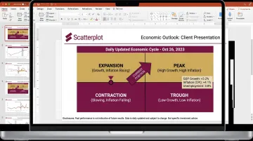
The economic cycle chart is one of the most effective tools for delivering that clarity. Rather than debating any single data point, it places current conditions within a historical framework that most clients can grasp quickly.
This article explains what an economic cycle chart shows, how to read each of its four phases, what indicators signal transitions between phases, and how advisers can use the chart practically in client conversations.
Key Takeaways
- The economic cycle moves through four stages: expansion, peak, contraction, and trough. The sequence is predictable; the duration never is.
- The NBER officially dates U.S. cycle turning points, though confirmation typically arrives months after the fact
- Investment teams use an early/mid/late/recession framework to connect cycle phases to asset class behavior
- Yield curve shape and manufacturing PMI can signal cycle transitions well before official confirmation arrives
- Stale cycle charts erode credibility in client meetings — always-current visuals keep those conversations grounded
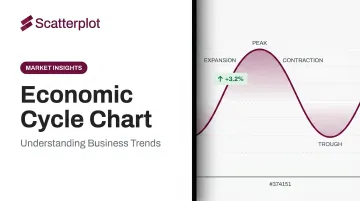
What Is an Economic Cycle Chart?
An economic cycle chart — also called a business cycle chart, and the terms are genuinely interchangeable — is a visual representation of the recurring pattern of expansion and contraction in overall economic activity. GDP-linked output sits on the vertical axis; time runs along the horizontal. The resulting wave pattern shows how the economy moves through periods of growth and decline over time.
The chart's value is diagnostic, not predictive. It gives advisers a framework for identifying where the economy appears to stand right now relative to its historical pattern of peaks, troughs, expansions, and contractions — not a guarantee of what comes next.
The NBER's Role — and Why It Creates a Real-Time Gap
The National Bureau of Economic Research serves as the official arbiter of U.S. business cycle dates. Its Business Cycle Dating Committee identifies the months of peaks and troughs by evaluating depth, diffusion, and duration across multiple monthly indicators — not GDP alone. That last point matters: NBER has noted that the 2001 recession did not involve two consecutive quarters of declining real GDP, which is why the popular "two negative quarters" rule is not NBER's method.
The practical challenge for advisers: NBER confirms turning points well after they occur. Recent examples illustrate the gap:
- The February 2020 peak was dated in June 2020 — roughly four months later
- The April 2020 trough was dated in July 2021 — approximately 15 months after the fact
- NBER's own FAQ notes the committee has historically taken 8 to 21 months after a trough to make an announcement
That lag is precisely why real-time cycle frameworks matter. By the time NBER confirms a turning point, the client conversation is already overdue.
The Four Stages of the Economic Cycle
The cycle moves through four stages in a consistent sequence. How long each stage lasts, though, varies enormously — and that variation matters for how advisers position client portfolios.
Expansion
This is the economy's baseline operating mode. GDP rises, employment grows, consumer spending increases, and corporate profits improve. Credit is accessible and interest rates typically stay low in the early portion. Expansion is typically the longest phase — NBER data shows the average postwar expansion ran 64.2 months, compared to average contractions of just 10.3 months.
Peak
The peak marks the upper turning point: maximum economic output just before the cycle begins to reverse. Individual indicators may plateau or show brief mixed signals. Inflation pressures often build near the peak. Advisers who can identify peak conditions have a window to begin shifting portfolio positioning before the contraction becomes obvious in the data.
Contraction
GDP growth slows or turns negative, unemployment rises, and business investment falls. One distinction worth keeping clear for clients: a technical contraction (two consecutive quarters of negative GDP) is not the same as a formal NBER recession, which requires decline that is significant in depth, broad in diffusion, and sustained in duration. The 2022 example illustrates this well — two consecutive negative GDP quarters did not result in an NBER recession declaration, because other indicators didn't confirm broad deterioration.
Trough
The trough is the low point: the moment just before recovery begins. Sentiment is typically worst here, yet historically this phase offers the strongest forward-looking opportunity for economically sensitive assets. Recoveries often begin pricing in well before the trough is officially confirmed — waiting for certainty can mean missing the move.
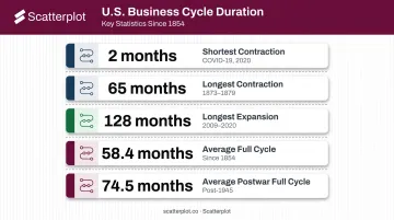
On duration: History shows there is no fixed clock. U.S. cycle lengths vary dramatically:
- Shortest contraction: 2 months (COVID-19, 2020)
- Longest contraction: 65 months (1873–1879)
- Longest expansion on record: 128 months (June 2009 – February 2020)
- Average full cycle (trough to trough) since 1854: 58.4 months (~4.9 years)
- Average postwar full cycle: 74.5 months (~6.2 years)
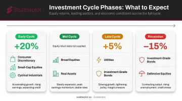
The Investment-Oriented Framework: Early, Mid, Late, and Recession
Economic textbooks use the four-stage model. Investment professionals use a refinement that maps more directly to asset class behavior: Early Cycle, Mid Cycle, Late Cycle, and Recession. This framework turns the cycle chart into a practical guide for portfolio construction, not just a conceptual model.
Early Cycle
Activity rebounds from recession lows, with GDP, employment, and incomes all recovering. Key characteristics of this phase:
- Credit begins to expand as lending conditions ease
- Corporate profit growth is rapid off a low base
- Monetary policy remains stimulative
- Inventories are lean while sales improve
Fidelity's business cycle research documents that stocks have historically delivered their strongest performance during this phase, with average annual returns exceeding 20%. Consumer discretionary, financials, and real estate have tended to lead.
Mid Cycle
Growth broadens and becomes self-sustaining, but the pace moderates. Credit growth remains strong, profit growth peaks, and monetary policy moves toward neutral. Inventories and sales reach equilibrium; the yield curve may begin to flatten.
Equities continue to benefit in this phase, though the relative advantage over other asset classes narrows compared to Early Cycle.
Late Cycle
The expansion matures and strains begin to show. Inflationary pressures build, credit tightens, and earnings come under pressure. Inventory growth often outpaces slowing sales. The yield curve may flatten or invert.
This phase typically calls for a gradual shift toward defensive, less economically sensitive exposures.
Fidelity's data puts average late-cycle stock returns at about 5% annually — well below the early-cycle average.
Recession Phase
Activity falls broadly; credit conditions tighten sharply; corporate profits decline; policy pivots from tightening to easing. Defensive sectors — utilities, consumer staples, healthcare — and high-quality fixed income have historically held up better. Fidelity's historical data shows recession-phase stocks averaged roughly -15% annually, while investment-grade bonds outperformed equities.
That said, J.P. Morgan Asset Management notes that markets have peaked anywhere from 0 to 13 months before recessions. That timing range is wide enough to make mechanical phase-to-allocation shifts risky without broader context.
Key Indicators That Signal Cycle Transitions
Cycle transitions don't announce themselves. They show up first in leading indicators, then in coincident data, and finally get confirmed by lagging signals — each category serving a distinct role.
| Indicator Type | What It Does | Examples |
|---|---|---|
| Leading | Moves before the economy | Yield curve shape, manufacturing PMI, building permits, initial jobless claims |
| Coincident | Reflects current conditions | Nonfarm payrolls, industrial production, real personal income |
| Lagging | Confirms after a shift | Unemployment rate, credit outstanding, average loan duration |
The Yield Curve as a Transition Signal
Yield curve shape is among the most closely watched leading indicators. The San Francisco Fed's research documents that every U.S. recession in the prior 60 years was preceded by a negative term spread, with the delay between inversion and recession ranging from 6 to 24 months. The 10-year minus 3-month Treasury spread carries the strongest academic support for recession forecasting. The 10-year minus 2-year spread is more commonly cited in practice, though both are widely tracked.
The Fed has cautioned that yield curve models will statistically absorb COVID-19's recession despite the pandemic — not financial imbalances — driving that contraction. No single indicator is infallible.
Other Signals Worth Watching
- Widening credit spreads — between investment-grade or high-yield bonds and Treasuries — signal rising stress, often before GDP data reflects it
- The ISM New Orders component (part of the Conference Board's Leading Economic Index) tends to turn before broader manufacturing activity
- Initial jobless claims lead nonfarm payrolls; sustained increases often precede official contraction calls by several weeks
These indicators are most useful when read in combination — and across geographies. The U.S. may be in late cycle while Europe is in early recovery, and that divergence has real implications. For advisers managing multi-asset or internationally diversified portfolios, tracking where major economies sit relative to each other affects relative equity performance, currency exposure, and fixed income positioning.
How Advisers Use Economic Cycle Charts in Client Conversations
The cycle chart is most valuable in client meetings not as a crystal ball, but as a context-setting tool. It helps clients understand why portfolio positioning may be shifting, why certain sectors are being emphasized, and why volatility at this particular point in the cycle is normal rather than alarming.
A Practical Workflow
- Identify the current phase using leading and coincident indicators — don't wait for NBER confirmation
- Connect the phase to historical asset behavior — show clients what has typically happened to equities, bonds, and specific sectors during similar phases
- Explain how portfolio positioning aligns with that view and what conditions would prompt a reassessment
- Invite questions — clients who understand the framework engage more constructively than those who receive abstract verbal explanations
Visual charts consistently outperform verbal descriptions in these conversations. Clients can see the logic, track where conditions are moving, and connect their own portfolio to something concrete.
The Stale Chart Problem
One practical risk: economic data releases frequently, and a cycle chart built last quarter may no longer reflect current conditions. An adviser presenting an outdated visual loses credibility quickly with informed clients — and the correction mid-meeting is uncomfortable.
That's what Scatterplot addresses directly. The platform delivers daily-updated economic and market visuals that advisers drop into branded client decks — each slide automatically refreshed so the data is current when the meeting starts. Every visual carries the adviser's logo, colors, and disclosures, with customization that takes a few minutes to configure once. Guided talking points accompany each chart, giving advisers specific language to move from "here's where the economy appears to be" to "here's what that means for your portfolio and time horizon."
When the visual is current and the narrative is prepared, the chart becomes a starting point — not a liability to explain away.
Disclaimer
The content on this site is for informational and educational purposes only and does not constitute financial, investment, legal, or tax advice. It should not be relied upon as the basis for any investment decision. Past performance is not indicative of future results. Always consult a qualified financial professional before making any financial decisions.
Frequently Asked Questions
What are the 4 stages of the economic cycle?
The four stages are expansion (rising GDP, employment, and spending), peak (maximum output before the cycle reverses), contraction (declining growth, rising unemployment), and trough (the low point before recovery begins). The sequence is consistent; the length of each stage varies widely.
What economic cycle are we in now?
No static article can give a reliable answer — NBER confirms turning points months after the fact, and conditions shift quickly. Monitor the yield curve, PMI data, and NBER announcements, and use regularly refreshed economic cycle charts to stay current.
How long does each stage of the economic cycle typically last?
NBER data shows the average trough-to-trough cycle since 1854 runs about 58.4 months (roughly 4.9 years), and 74.5 months postwar. Individual contractions have lasted as few as 2 months (COVID-19) and expansions as long as 128 months. Cycles are irregular, not mechanical.
How does the economic cycle affect investment decisions?
Different asset classes perform differently by phase. Early-cycle equities have averaged returns above 20% annually; recession-phase equities have averaged around -15%. Defensive sectors and high-quality bonds have historically held up better near and during downturns.
What is the difference between the business cycle and the economic cycle?
The terms are interchangeable. Both describe the recurring pattern of expansion and contraction in overall economic activity, measured by GDP, employment, and income.
What indicators do investors use to determine the current cycle phase?
Commonly tracked indicators include GDP growth, nonfarm payrolls, credit spreads, industrial production, and consumer spending. The yield curve (10-year minus 3-month Treasury spread) and manufacturing PMI draw the most attention as leading signals of phase transitions.