Introduction
A portfolio pie chart appears in nearly every client meeting, quarterly statement, and planning review in wealth management. It's one of the most familiar visuals in the industry — and one of the most misused.
Most advisers know how to build one. What's missing is the context clients actually need: what the slices mean, why the allocation was chosen, what the chart can't show, and when it should change.
How an adviser explains asset allocation directly shapes how confident a client feels in their financial plan. A well-constructed, well-communicated pie chart builds trust. A confusing or static one invites doubt, and sometimes triggers unnecessary portfolio changes at exactly the wrong moment.
This guide covers the core asset classes every allocation should reflect, the frameworks advisers use most, and what the pie chart doesn't show — so you can present it in a way that moves client conversations forward.
Key Takeaways
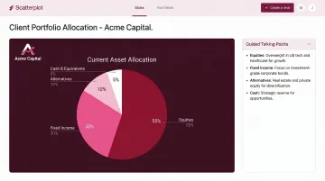
- A portfolio pie chart shows the percentage of a client's investments held in each asset class at a single point in time
- Common frameworks — 60/40, 90/10, age-based rules — are useful starting points, not universal answers
- Effective charts use 5–7 slices, show both percentage and dollar values, and are paired with adviser context
- Pie charts hide correlation, drift, and stock overlap — advisers need to address these gaps proactively
- Scatterplot delivers branded, daily-updated allocation visuals with guided talking points — cutting hours from adviser prep time
What Is an Investment Portfolio Pie Chart?
A portfolio pie chart is a circular visual that divides a portfolio into proportional slices, with each slice representing a different asset class, sector, or holding. Clients can see at a glance how their wealth is distributed: 60% equities, 30% bonds, 10% cash, for example.
It shows up across adviser presentations, quarterly account statements, 401(k) interfaces, and financial planning reviews. Morningstar's Portfolio Snapshot Report, for instance, uses asset-class pie charts for portfolio analysis, recommendations, and client reporting, a reflection of how central this visual has become to the adviser toolkit.
What It Does and Doesn't Show
That centrality can create problems. Advisers often rely on the chart to carry a conversation it isn't built to support. A pie chart communicates proportional allocation at a single moment — nothing more. It does not show:
- Performance — a slice's size says nothing about its recent returns
- Risk level — two portfolios with identical charts can carry very different risk profiles
- Correlation — whether the assets move together in a downturn
- Drift — the actual current allocation may differ from what was targeted six months ago
One technical note: pie charts cannot represent negative positions or allocations that exceed 100%. Morningstar's own tools automatically convert to a bar chart in those cases. For most client portfolios, this isn't an issue, but keep it in mind for edge cases involving short positions or leverage.
Used well, the chart opens a conversation. The adviser's job is to explain what the slices don't say.
Core Asset Classes Every Portfolio Pie Chart Should Include
Equities (Domestic and International)
Equities are the growth engine of most portfolios. J.P. Morgan Asset Management's Guide to the Markets shows U.S. large-cap equities returning 9.5% annualized (2002–2021) with 16.9% volatility, while emerging markets returned 10.0% with 23.2% volatility.
International exposure deserves its own slice — not just a footnote. Vanguard's global equity research found that portfolio volatility has typically been reduced most with international allocations between 35% and 55% of the equity portion.
That same research found U.S.-international equity correlation rose from 0.51 in 1989 to 0.86 by late 2020. When clients question why international exposure still matters, that narrowing diversification benefit — not the return story alone — is the honest answer.
Fixed Income / Bonds
Bonds provide income, reduce overall volatility, and have historically served as a buffer during recessions. Morningstar's recession analysis found that high-quality bonds posted positive gains across all eight recessionary periods examined. The fixed-income allocation typically increases as time horizons shorten or risk tolerance drops.
Cash and Cash Equivalents
Cash (money market funds, T-bills, short-term savings) plays a legitimate role as a liquidity buffer — for near-term goals or as dry powder. The caution: a cash slice that's too large erodes real returns over time. J.P. Morgan's data shows T-bills returned just 1.2% annualized from 2002–2021, well below inflation's long-run pace.
Alternative Investments
REITs returned 11.2% annualized over the same J.P. Morgan period — the highest of any asset class in that dataset. Alternatives can add diversification when their correlation to public markets is genuinely low:
- REITs — real estate exposure with liquid access and income yield
- Commodities — inflation hedge with low or negative equity correlation in some regimes
- Private equity — strong long-term return history, but illiquidity requires careful suitability review
Private credit is gaining traction as well, particularly for clients seeking yield without full public-market exposure.
Sub-Allocation by Region or Sector
Some advisers break the equity slice into U.S., developed international, and emerging markets. Others add sector-level detail. This can add useful context for certain clients — but beyond 7 slices total, chart readability drops quickly. Consider a secondary chart for that level of granularity.
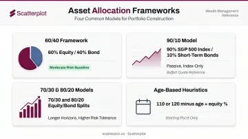
Common Asset Allocation Frameworks Advisers Use
The 60/40 Framework
The 60% equity / 40% bond split has been the baseline for moderate-risk investors for decades. J.P. Morgan's data shows a 60/40 blend returning 7.4% annualized (2002–2021) — compared to 3.6% for the average investor, who tends to buy high and sell low.
2022 challenged the model directly. Vanguard notes that 2022 marked the first time since 1977 that both stocks and bonds had negative returns simultaneously, driven by aggressive rate hikes. The 60/40 remains valid, but advisers are right to explain its limitations — particularly the assumption that bonds always offset equity losses.
The 90/10 Model (Buffett's Approach)
Warren Buffett's often-cited recommendation isn't a standard 70/30 or 80/20 model. In Berkshire Hathaway's 2013 annual letter, Buffett described specific instructions for his wife's trust: "Put 10% of the cash in short-term government bonds and 90% in a very low-cost S&P 500 index fund. (I suggest Vanguard's.)"
This is a simple, passive, index-based approach — not an actively managed equity-heavy allocation. The distinction matters when clients cite it as justification for a highly aggressive portfolio managed by active strategies.
The 70/30 and 80/20 Models
These equity-heavier frameworks suit investors with longer time horizons or higher risk tolerance. They're reasonable starting points for clients in their 30s and 40s who can weather short-term drawdowns in exchange for higher long-term growth potential.
Age-Based Heuristics
The "110 minus age" rule (or 120 minus age, depending on the source) gives a quick equity allocation estimate. A 50-year-old, for example, might hold 60–70% in equities under this framework.
Kiplinger describes it as a useful heuristic, not a prescription. The limitations are real:
- Ignores actual risk tolerance and income needs
- Doesn't account for significant wealth or pension income
- Treats all clients the same age as identical investors
It works best as a starting point for deeper discovery — not a substitute for it.
What Makes a Portfolio Pie Chart Effective — and Its Limitations
Design Principles That Actually Matter
A clear, client-ready allocation chart should:
- Limit slices to 5–7 — beyond that, small slivers become unreadable and confusing
- Show both percentage and dollar values — "30%" means more when a client sees it's $180,000
- Use consistent color coding by asset class across all presentations
- Include a brief narrative — the chart should never be left to explain itself
Limitation: Correlation Is Invisible
Two portfolios with identical pie charts can behave completely differently in a downturn if their holdings are highly correlated. The Vanguard data showing U.S.-international correlation rising from 0.51 to 0.86 over three decades is a clear example: more slices don't automatically mean more diversification.
Meir Statman's research found that a well-diversified portfolio requires at least 30–40 randomly chosen stocks. A fund-heavy chart with five slices might look diversified while holding the same underlying securities across multiple positions.
Limitation: Drift and the Static Snapshot Problem
Allocation naturally drifts as asset classes appreciate or decline at different rates. A 60/40 portfolio in a strong equity year might look closer to 70/30 by year-end, without any trades being made.
Vanguard's best-practices research recommends annual or semiannual monitoring with a 5% rebalancing threshold as the right balance between risk control and transaction costs. The practical implication: the pie chart from last quarter's review may not reflect the portfolio's actual allocation today.
Limitation: Stock Overlap and False Diversification
Multiple funds in different allocation categories often hold identical underlying securities. A large-cap U.S. equity ETF and a "balanced" fund might both hold the same top 20 S&P 500 names in significant weights.
Morningstar's Stock Intersection tool addresses this by looking through fund and ETF holdings to surface the top 50 concentrated positions across a portfolio. To catch overlap before it becomes a problem, advisers should:
- Review holdings-level data alongside the pie chart
- Check for repeated top-10 positions across two or more funds
- Flag any fund labeled differently that shares significant underlying securities with another holding
How Scatterplot Helps Advisers Present Portfolio Allocation Visuals
Building a strong allocation narrative for client meetings takes time — sourcing current data, constructing charts, matching them to brand standards, and then prepping talking points so the conversation doesn't stall on the visual itself.
Scatterplot was built specifically for wealth managers and financial advisers who need that process to be faster and more consistent. The platform delivers a dynamic library of client-ready investment slides, updated regularly from third-party data sources — so the charts advisers bring to meetings reflect current market context, not last quarter's numbers.
Every slide is fully branded with the adviser's logo, colors, and compliance disclosures. Clients notice when visuals match the firm's identity — a signal of professionalism that requires no additional design work.
Scatterplot also pairs each chart with guided talking points. That turns a static allocation slide into a structured conversation — helping advisers connect the chart to the client's goals, explain the rationale behind each slice, and address limitations like correlation and portfolio drift before clients raise them.
Founded by Sanjeev Pati, CFA, the platform is built on rigorous investment analysis — Pati's CFA background shapes both the data sources and how they're presented. The subscription runs $99/month, with a 7-day free trial.
Conclusion
A portfolio pie chart is a powerful tool when it's built around the right asset classes, tied to a deliberate allocation framework, and presented with the context clients need to understand what they own and why.
That said, correlation, drift, and stock overlap are real risks the chart itself won't surface. Advisers who address these gaps directly — rather than leaving clients to wonder — build stronger, longer-lasting relationships.
Portfolios drift, markets shift, and client goals evolve. Treating the pie chart as a living document — updated regularly and reviewed against what's changed — turns a snapshot into an ongoing planning conversation. Platforms like Scatterplot support exactly that, giving advisers daily-updated visuals they can bring to every client review without rebuilding from scratch.
Disclaimer
The content on this site is for informational and educational purposes only and does not constitute financial, investment, legal, or tax advice. It should not be relied upon as the basis for any investment decision. Past performance is not indicative of future results. Always consult a qualified financial professional before making any financial decisions.
Frequently Asked Questions
What is the 7-5-3-1 rule for an investment portfolio?
The 7-5-3-1 rule originates from Indian mutual fund SIP investing, not U.S. adviser practice — it's not a formal asset allocation framework. Treat it as informal guidance, and source it carefully before referencing it in client conversations.
What is Warren Buffett's 70/30 rule for an investment portfolio?
Buffett's actual recommendation, from Berkshire's 2013 annual letter, is 90% in a low-cost S&P 500 index fund and 10% in short-term government bonds. It's a passive, index-only approach designed for a simple trust structure — not a template for an actively managed client portfolio.
What is the 70/20/10 rule for an investment portfolio?
The 70/20/10 framework allocates 70% to long-term growth, 20% to medium-term investments, and 10% to short-term or liquid reserves. It sees more use in personal budgeting than formal U.S. portfolio construction, so it works best as a goal-based conversation starter with clients.
What is the 3-rule approach to an investment portfolio?
The most widely documented version in planning practice is the three-bucket strategy: short-term liquidity, medium-term stability, and long-term growth. It organizes client conversations around when they'll need their money — a more grounded starting point than leading with return targets alone.
How many slices should an investment portfolio pie chart have?
Five to seven slices is the practical maximum for client-facing charts. Beyond that, small slivers become unreadable and clients lose the thread of what they're looking at. When more granularity is needed — regional equity breakdowns, for example — use a secondary chart.
How often should you rebalance a portfolio based on the pie chart?
Vanguard's research supports annual or semiannual monitoring with a 5% drift threshold for most diversified portfolios. A drift of more than 5 percentage points from target is a clear rebalancing trigger and a natural moment to walk clients through an updated pie chart.