Introduction
Every adviser has fielded some version of this question: "Why didn't we own more of that last year?" It's the performance-chasing conversation — and it's one of the hardest to navigate without the right visual tool.
A quilt chart answers that question directly. It compresses a decade of market complexity into a single scannable grid, showing clients exactly how unpredictable annual rankings really are. Rather than defending last year's allocation with words, you show the data.
According to Callan's Periodic Table of Investment Returns, first created in 1999, this format has become the wealth management industry's most recognized tool for illustrating return dispersion across asset classes. The 2025 version reveals some notable surprises — international equities rebounded, bonds recovered modestly, and cash finally stopped looking like the obvious safe harbor it was in 2023–2024.
This guide walks through how to read quilt charts, what the latest data reveals, and how to put them to work in client conversations that move from emotional to strategic.
Key Takeaways
- A quilt chart ranks asset classes from best to worst return each year in a color-coded grid — no single asset class has stayed on top for more than two consecutive years.
- 2025 brought a notable shift: international developed equities led U.S. large caps for the first time in years.
- The S&P 500 delivered 17.88% total return in 2025, but its relative ranking dropped.
- Used in client meetings, quilt charts turn emotional market reactions into productive allocation conversations.
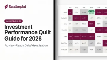
What Is an Investment Performance Quilt Chart?
A quilt chart is a color-coded, year-by-year grid that ranks major asset classes from highest to lowest return for each calendar year. Each asset class gets a consistent color, and because the rankings shuffle every year, the resulting pattern looks like a patchwork quilt — hence the name.
The format was created by Jay Kloepfer at Callan LLC in 1999. That first table covered calendar years 1979–1998 and was distributed to institutional clients to illustrate return dispersion across asset classes. J.P. Morgan, BlackRock, Morningstar, and Thrivent have since published their own versions.
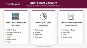
The Three Main Variants
Most advisers encounter three types:
- Asset class quilt charts — broad categories like U.S. equities, international equities, bonds, REITs, commodities, and cash. This is the most common version used in client meetings.
- Sector quilt charts — S&P 500 sectors (technology, energy, healthcare, financials, etc.), useful for illustrating rotation within domestic equities.
- Fixed income quilt charts — sub-categories within bonds (investment-grade, high yield, TIPS, global bonds), valuable for fixed income-focused conversations.
Each version uses a specific set of benchmark indices as proxies for each color block. Callan, for example, uses the S&P 500 for U.S. large caps, the MSCI World ex USA for developed international, and the Bloomberg U.S. Aggregate for core bonds.
Which index sits behind each color block matters. Different publishers use different proxies, and that choice can produce noticeably different return figures for the same "asset class" label — so always check the methodology before comparing charts across sources.
Key Insights from the 2025 Asset Class Quilt Chart
2025 was a year that challenged several assumptions built up over the prior decade.
International Stocks Finally Led
The most notable development: developed international equities moved to the top of the Callan quilt for 2025, outranking U.S. large caps. The S&P 500 delivered a strong 17.88% total return (per S&P Dow Jones Indices), but international developed markets — using Callan's MSCI World ex USA proxy — came in ahead. A weakening U.S. dollar, compressed valuation gaps between domestic and foreign equities, and improving global growth dynamics all contributed to the shift.
This is the kind of single-year result that can either reinforce or undermine a client's conviction in diversification, depending on how it's framed.
The S&P 500's Decade Still Looks Exceptional
One year of relative underperformance doesn't erase a decade of dominance. U.S. large caps have delivered exceptional annualized returns over the 10-year window through 2025. The more useful adviser conversation draws the parallel to 2000–2009 — the "lost decade" for large caps, when Dimensional's research on two-decade returns shows just how thoroughly the top performer of one decade can become the laggard of the next.
Bonds: A Modest Recovery After a Brutal Stretch
The Bloomberg U.S. Aggregate Bond Index candidate data from Callan's 2025 table shows approximately 7.30% for the U.S. fixed income category — a meaningful improvement after years of near-cash-equivalent returns. The zero-rate era suppressed bond returns for years, and the rapid rate hikes of 2022–2023 caused significant mark-to-market losses. Higher current yields have since improved the forward outlook. This is exactly the conversation advisers need to have with clients who wonder why bonds belong in the portfolio at all.
Cash: Attractive, But Not a Strategy
Cash (90-day T-bills) delivered roughly 4.18% in 2025 based on Callan's data — a dramatic reversal from the near-zero years of 2015–2021. That reversal created a behavioral challenge: clients who felt validated by cash holdings in 2023–2024 are now harder to convince about extending duration. The quilt chart helps here by showing that cash's attractive recent ranking is part of a pattern — and that pattern has historically reversed.
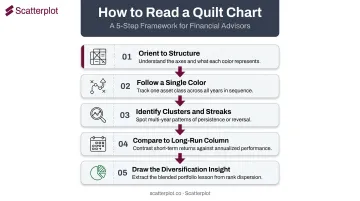
How to Read a Quilt Chart: A Step-by-Step Guide
The quilt chart rewards methodical reading — scanning it quickly is how advisers and clients reach the wrong conclusions.
Step 1 – Orient to the Structure
- Horizontal axis: calendar years, running left to right
- Vertical axis within each column: asset classes ranked from highest return (top) to lowest (bottom)
- Color coding: each asset class has a consistent color across all years — the quilt pattern emerges as colors move up and down the stack
Step 2 – Follow a Single Color Across Years
Pick one asset class — say, U.S. large caps — and trace its color across the full time span. The color rarely stays in the same row two years in a row. That visual randomness is the chart's core lesson: short-term return prediction is far harder than it looks in hindsight.
Step 3 – Identify Clusters and Streaks
Multi-year dominance does occur. U.S. large caps held consistent top-half positioning from roughly 2013 through 2024. Streaks are always more obvious in hindsight than in real time. A client who saw the streak forming in 2015 would have been wrong to bet it continued indefinitely — and the 2025 quilt already shows the cracks.
Step 4 – Compare Annual Rankings to the Long-Run Column
Those streaks look different when you zoom out. Most quilt charts include a far-right column showing 10- or 20-year annualized returns — often the most important column on the page. Short-term leaders and long-run leaders frequently don't match: an asset class that dominated recent years may rank in the middle of the long-run column, while one that lagged last year may sit near the top over 20 years.
Step 5 – Draw the Diversification Insight
Look for the diversified or equal-weight blended portfolio row (often labeled "Asset Alloc." or "EW"). It rarely wins in any given year. But over the full time span, it delivers competitive long-run returns without the volatility of chasing last year's winner. You don't have to win every year to win over time — and this row makes that case visually, without a single word of explanation.
How Financial Advisers Use Quilt Charts in Client Conversations
The quilt chart is, above all else, a behavioral coaching tool.
Handling the "Why Didn't We Own More of X?" Question
When a client points to last year's top performer and asks why the portfolio didn't hold more of it, the quilt chart answers the question visually without requiring a lengthy verbal defense. Show them where that asset class ranked the year before. And the year before that. The randomness of the color pattern becomes the argument itself.
Annual Review Meetings
Walk clients through the most recent year's column, then immediately zoom out to the 10-year annualized column on the right. The contrast — between where an asset class ranked last year and where it stands over the full decade — is usually enough to anchor the conversation in long-term logic rather than recent results.
The Rebalancing Conversation
When an asset class sits at the bottom of the quilt, clients instinctively want to sell it. The quilt chart shows that today's laggard has consistently rotated back toward the top — sometimes within a year or two. That historical pattern supports the case for disciplined rebalancing rather than reactive selling.
The chart makes three things easier to communicate in this moment:
- Show the rotation pattern — past laggards that climbed back into the top tier
- Reframe recency bias — one bad year rarely predicts the next
- Anchor the rebalancing rationale — selling low contradicts what the data consistently shows
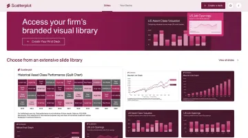
Scatterplot provides wealth advisers with daily-updated, fully branded quilt chart slides, along with guided talking points for each visual. Instead of spending hours sourcing return data, building color-coded grids, and reformatting decks, advisers access a ready-to-present library with their firm's logo, colors, and disclosures already applied. The prep time shrinks; advisers spend more of the meeting on strategy, less on explaining data.
Common Mistakes When Interpreting Quilt Charts
Recency Bias
The most common error is assuming the top performer will repeat. The quilt chart itself disproves this — but clients won't automatically read it that way. If you show a chart where one color has sat near the top for several years, some clients will extrapolate that forward. Advisers need to explicitly name the recency bias, not just show the chart and hope the lesson lands.
Ignoring the Time Horizon
Single-year columns tell a very different story than the long-run column. Advisers who focus only on recent years can reinforce performance-chasing behavior rather than correcting it. The 10-year column is not decorative — it's the main event.
Confusing Asset Class Proxies
Different quilt charts use different indices for the same label. Callan uses MSCI World ex USA for developed international; some other versions use MSCI EAFE. The difference can produce different return figures for what looks like the same category.
Advisers should know which index underlies each color block in the chart they're presenting — and disclose this to clients to avoid apples-to-oranges comparisons across different versions.
How Scatterplot Can Help
Building a quilt chart manually is a real time commitment. Sourcing accurate annual returns for eight or more asset classes, constructing a properly formatted color grid, applying firm branding, and adding compliance disclosures — before every client meeting cycle — can consume hours that would be better spent on the conversation itself.
Scatterplot eliminates that prep burden. The platform gives financial advisers a library of investment slides — including quilt charts and other market insight visuals — with their firm's logo, colors, and disclosures already applied. Each chart updates automatically, so advisers never walk into a meeting with stale data.
The platform's guided talking points are where it stands out in practice:
- Auto-updated charts pull current return data so the quilt reflects this year's rankings, not last year's
- Firm-branded slides apply your logo, color palette, and compliance disclosures to every visual
- Client-ready talking points translate multi-year return patterns into plain language — no scripting required
- PDF and web access make slides compatible with any standard meeting workflow
At $99/month (with a 7-day free trial), Scatterplot gives financial advisers and wealth managers client-ready visuals without the manual overhead.
When a client asks why their portfolio lagged last year's top performers, the conversation goes better when the chart behind your answer already has your name on it.
Disclaimer
The content on this site is for informational and educational purposes only and does not constitute financial, investment, legal, or tax advice. It should not be relied upon as the basis for any investment decision. Past performance is not indicative of future results. Always consult a qualified financial professional before making any financial decisions.
Frequently Asked Questions
What is the 7-5-3-1 rule in investing?
The 7-5-3-1 rule is an informal return expectation framework suggesting approximate long-run annual returns: roughly 7% for stocks, 5% for balanced portfolios, 3% for bonds, and 1% for cash. These are historical rough guides, not guarantees — and the quilt chart illustrates exactly how much actual returns can deviate from these averages in any given year or decade.
What is a 25/25/25/25 portfolio?
The 25/25/25/25 concept (often called the "permanent portfolio") equally allocates across four asset classes — typically stocks, bonds, gold, and cash. A quilt chart shows how each component has ranked historically, illustrating why equal-weight diversification can smooth volatility when individual pieces cycle through underperformance.
Is 70/30 better than 60/40?
"Better" depends on time horizon and risk tolerance. Historically, 70/30 has delivered higher returns with more volatility; 60/40 offers more stability at lower expected growth. A quilt chart helps advisers show clients this tradeoff visually, letting the data speak rather than abstract percentages.
What is the 70/20/10 rule for investing?
The 70/20/10 framework allocates 70% to core growth assets (equities), 20% to income or defensive assets (bonds, REITs), and 10% to speculative or alternative positions. A quilt chart helps evaluate how each component has performed across different market environments — putting the guidelines in historical context.
What asset classes are typically shown in a quilt chart?
Standard versions include U.S. large cap stocks, U.S. small/mid cap stocks, international developed equities, emerging market equities, investment-grade bonds, TIPS, REITs, commodities, and cash. Some versions add sector-level breakdowns or fixed income sub-categories like high yield and global bonds.
How often should a quilt chart be updated for client presentations?
Annual updates (after year-end data is finalized) are standard, but always-current versions are more valuable. Platforms like Scatterplot handle automatic updates, so advisers never present outdated return data — particularly important for advisers doing frequent client reviews throughout the year.