Introduction
Most investors spend under three minutes reviewing a pitch deck before deciding whether to engage further. Unsuccessful decks are often discarded after just 90 seconds. For financial advisers, wealth managers, and investment professionals, that window is the entire first impression.
A pitch deck is a concise, visual presentation — typically 10–15 slides — used to communicate a business or investment opportunity to potential investors. Getting it right is the difference between a follow-up meeting and a polite pass.
This guide covers what a pitch deck is, which slides to include, how to build one step by step, and the mistakes that cause strong pitches to fail. Whether you're pitching your own firm, a fund, or guiding a client through fundraising, you'll leave with a clear framework to build a deck that earns the next conversation.
Key Takeaways
- An investment pitch deck earns a meeting — it doesn't close a deal
- Every effective deck answers four questions: What problem? How big? Who's the team? What's the ask?
- Aim for 10–15 slides; narrative flow matters more than information volume
- Investors spend about 2:42 with the average deck — make every second count
- The most common deal-killers: no clear ask, unsupported claims, cluttered slides
What Is an Investment Pitch Deck and Why It Matters
A pitch deck is a brief, slide-based presentation — shared as a PDF or presented live — that gives investors a structured snapshot of a business opportunity. It covers the problem, solution, market size, business model, team, and funding ask.
It has largely replaced the traditional business plan as the first formal document investors review. That shift matters because brevity demands more precision, not less. Every claim must earn its place on a single slide.
The true purpose of a pitch deck is narrow: generate enough interest that an investor agrees to a follow-up meeting. It is not a diligence document. Success is measured by that next conversation, not by how thoroughly the deck covers every business detail.
The odds reflect how selective that process is. Research by Gompers, Gornall, Kaplan, and Strebulaev across 885 institutional VCs at 681 firms found that the average VC firm screens 200 companies annually and makes just 4 investments. The deck is your entry point into that funnel — and most pitches never get past it.
The Essential Slides Every Investment Pitch Deck Needs
Cover and Problem Slides
The cover slide needs three things: company name, a one-line description of what you do, and contact information. Nothing more.
Your problem slide is where most pitches win or lose attention. Define a specific, urgent pain point backed by data — investors need to feel the problem before they'll care about the solution. Vague statements like "businesses struggle with inefficiency" don't work. Concrete numbers and real scenarios do.
Solution, Product, and Competition
The solution slide should show exactly how your product or service addresses the stated problem. A screenshot or visual demonstration outperforms paragraphs of description every time.
The competition slide deserves more scrutiny than most founders expect. DocSend's research found that investor focus on competition slides increased 51% compared to prior years — meaning investors are scrutinizing this more than ever. Avoid two common traps:
- Claiming "no real competition" (investors won't believe it)
- Feature comparison tables that list checkmarks without explaining why your approach is meaningfully better
Market Opportunity
The standard investor framework for market sizing uses three nested concepts:
| Metric | Definition |
|---|---|
| TAM | Total Addressable Market — the full potential market in annual revenue |
| SAM | Serviceable Addressable Market — the portion you can realistically reach |
| SOM | Serviceable Obtainable Market — what you can actually capture near-term |
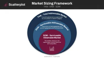
YC's guidance is direct: top-down market figures from research reports are often too generic. A bottoms-up calculation built from real business data is more credible and harder to challenge.
Business Model and Financial Projections
The business model slide should explain how revenue is generated and what unit economics look like. Keep it visual and direct — one clear diagram is worth more than three paragraphs.
Financial projections flow naturally from your business model — they show whether the math actually works at scale. Cover 3–5 years of revenue and EBITDA, and ground every assumption in something defensible. YC flags several financial slide mistakes to avoid:
- Too many numbers (overloads the reviewer)
- Cumulative metrics that hide weak monthly performance
- Double-axis graphs that require explanation
For financial advisers who regularly build investor-facing presentations, assembling polished financial charts from scratch for every pitch is time-intensive. Platforms like Scatterplot deliver daily-updated, branded market and economic visualizations that advisers can pull directly into presentations — eliminating the manual work of sourcing data, building charts, and applying firm branding each time.
Team and Ask Slides
Many team slides underperform by listing names and headshots when investors are asking one question: why this team?
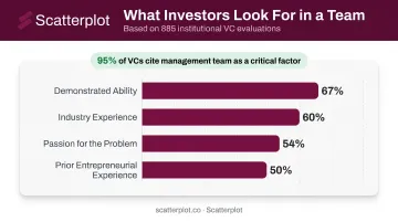
A survey of 885 institutional VCs found that 95% cite the management team as a critical factor — and 47% named it the single most important investment-selection factor. The qualities that drive those assessments:
- Demonstrated ability (67%)
- Industry experience (60%)
- Passion for the problem (54%)
- Prior entrepreneurial experience (50%)
The ask slide must state:
- Exactly how much is being raised
- At what valuation or terms
- How the proceeds will be used
- The expected traction milestone in 18–24 months
Without a specific ask, investors have no anchor — and decks without one routinely get deprioritized in review.
How to Build Your Investment Pitch Deck Step by Step
Step 1: Define Your Narrative and Investor Fit
Before building a single slide, identify the one story your deck needs to tell. Not a product tour — a compelling case for why this opportunity exists now and why this team is positioned to capture it.
Then research your target investors. Confirm that the deck matches their:
- Investment thesis and stage focus
- Current portfolio (avoid obvious conflicts)
- Check size and sector preference
Sending the same untargeted deck to 50 investors reads as a lack of preparation — and most experienced investors will notice immediately.
Step 2: Gather and Structure Your Content
Compile the evidence investors will evaluate:
- Market data — bottoms-up TAM/SAM/SOM with sources
- Competitive analysis — honest mapping of alternatives and your differentiation
- Financial model — projections with clearly stated assumptions
- Team backgrounds — relevant credentials, prior outcomes, key hires needed
- Traction metrics — use benchmarks appropriate to your sector (ARR/MRR for SaaS, AUM for investment funds, LTV/CAC for direct-to-consumer)
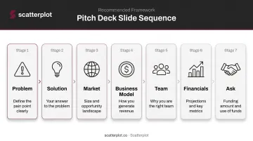
Sequence slides to build logically: problem → solution → market → business model → team → financials → ask. A good test: send the deck without any verbal context and see if the story holds on its own.
Step 3: Refine for Clarity and Consistent Presentation
Apply a strict editing pass using one rule per slide: one idea, communicated in under 10 seconds of scanning.
- Replace sentences with short phrases
- Replace paragraphs with visuals
Ask someone outside your organization to read the deck cold and explain your pitch back to you. If they can't, it needs revision.
This same principle applies beyond startup fundraising. Financial advisers who present to clients regularly face an identical challenge: maintaining a consistent, credible look across every investor conversation. Scatterplot's branded slide library — with your logo, colors, and compliance disclosures built in — lets advisers meet that standard without rebuilding decks from scratch before each meeting.
Design and Visual Principles That Win Investor Attention
Good design serves the message. It doesn't decorate it.
What signals professionalism:
- Clean, uncluttered layouts with adequate white space
- Readable fonts at sufficient size (Kawasaki's 30-point minimum remains practical advice)
- Restrained color palettes — two to three colors maximum
- Charts that tell a story at a glance
What kills credibility:
- Gradient-heavy backgrounds
- Generic stock photography
- Circular diagrams that require reading to decode
- Double-axis graphs that obscure performance
The SEC's Plain English guidance for investor communications recommends informative headings, short sections, tables, charts, and white space to improve comprehension. The same principles apply to pitch decks.
Every financial chart in the deck should pass one test: can an investor understand what it shows within five seconds, without the presenter explaining it? If not, redesign it. The CFA Institute holds that high-quality financial disclosures are essential to investor trust — and a chart that needs explaining undermines both.
Design choices also affect how the deck gets consumed. Share a PDF rather than a platform-tracked link where possible. Only 58% of seed decks are viewed to completion, meaning most investors read your deck alone, at their own pace — without you in the room to clarify a confusing visual.
Common Pitch Deck Mistakes and How to Avoid Them
No Clear Ask
The most frequent and damaging error. Investors expect to see exactly how much is being raised, on what terms, and what the money will accomplish. A deck without this information tells investors you either haven't decided, or haven't thought through what raising capital actually requires.
Unsupported or Inflated Claims
Three patterns that destroy credibility immediately:
- Massive unsourced TAM — a multi-billion dollar market figure with no methodology
- "No real competition" — investors know this is never true
- Hockey-stick projections — explosive growth curves with no stated basis
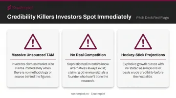
Investors will press hard on all three in any follow-up meeting. Founders who acknowledge risks and competitive dynamics earn more credibility than those who paper over them with optimistic framing.
Visual and Copy Overload
Slides crammed with dense text, layered infographics, or oversized timelines force investors to work to find the message. The instinct to show all the work buries the most important information.
A useful test: if a slide can't communicate its core point in under 10 seconds, something needs to be cut. Common culprits include:
- Paragraphs where a single sentence would do
- Charts that require a legend to decode
- Timelines with more than 5–6 milestones
Team Slide Failure
Listing names, titles, and photos without explaining why this team misses the entire point of the slide. What investors want to know:
- What relevant experience qualifies this team to execute in this specific space?
- What key roles are still open, and how is the company addressing those gaps?
The team slide exists to answer one question: why are these specific people the right ones to build this company? Answer that directly — don't leave investors to infer it.
Disclaimer
The content on this site is for informational and educational purposes only and does not constitute financial, investment, legal, or tax advice. It should not be relied upon as the basis for any investment decision. Past performance is not indicative of future results. Always consult a qualified financial professional before making any financial decisions.
Frequently Asked Questions
How many slides should an investment pitch deck have?
Most effective pitch decks run 10–15 slides for live presentations, with Guy Kawasaki's 10-slide rule and YC's Series A template as common references. Send-ahead PDF decks can run longer — DocSend's seed research points to 19–20 pages — but live settings reward brevity above all.
What is the most important slide in a pitch deck?
The problem slide and the ask slide are the most critical. The problem slide must earn investor attention immediately — no compelling problem means no foundation for the rest of the deck. The ask slide defines the purpose of the entire pitch; it's what you're there to secure.
What is the difference between a pitch deck and a business plan?
A business plan is a detailed written document covering every aspect of the business in depth. A pitch deck is a concise visual summary designed to spark interest and secure a meeting. Both require rigorous thinking, but the deck prioritizes narrative clarity over completeness.
How long should a pitch deck presentation take?
A standard investor pitch runs 15–20 minutes, with time reserved for questions. Demo days may allow only 5 minutes. This is why every slide must stand alone — most investors will review the deck without a presenter before any live meeting occurs.
What financial data should be included in a pitch deck?
Standard expectations include 3–5 year revenue and EBITDA projections, relevant traction metrics (ARR, AUM, LTV/CAC), and a clear use-of-proceeds breakdown. Fund pitches carry additional requirements: historical net and gross IRR, TVPI, DVPI, and RVPI are typically expected per ILPA and GIPS standards.
How do I tailor a pitch deck for different types of investors?
Keep the core deck consistent and shift the talk track based on investor type. Early-stage investors focus on team and vision; later-stage investors prioritize traction, unit economics, and scalability. Research each investor's thesis and portfolio before the meeting — that preparation matters more than customizing slides for every outreach.